Step-by-Step Excel Dashboard Tutorial for Beginners
Introduction
Excel dashboards are powerful tools that help you visualize data, track key performance indicators, and make data-driven decisions quickly. If you’re new to Excel dashboards, this tutorial will guide you through the process of creating your very first dashboard step-by-step. We will cover the basics of data organization, chart creation, and dashboard assembly with practical examples and clear action steps.
Step 1: Prepare Your Data
Before building any dashboard, organizing your data is crucial. Your data should be clean, well-structured, and stored in a tabular format.
- Open your Excel workbook and create a new worksheet named Data.
- Enter your dataset with clear headers. For example, create columns such as Month, Sales, Expenses, and Profit.
- Make sure there are no blank rows or columns within your dataset.
Example data:
| Month | Sales | Expenses | Profit |
|---|---|---|---|
| January | 10000 | 7000 | 3000 |
| February | 12000 | 7500 | 4500 |
| March | 15000 | 9000 | 6000 |
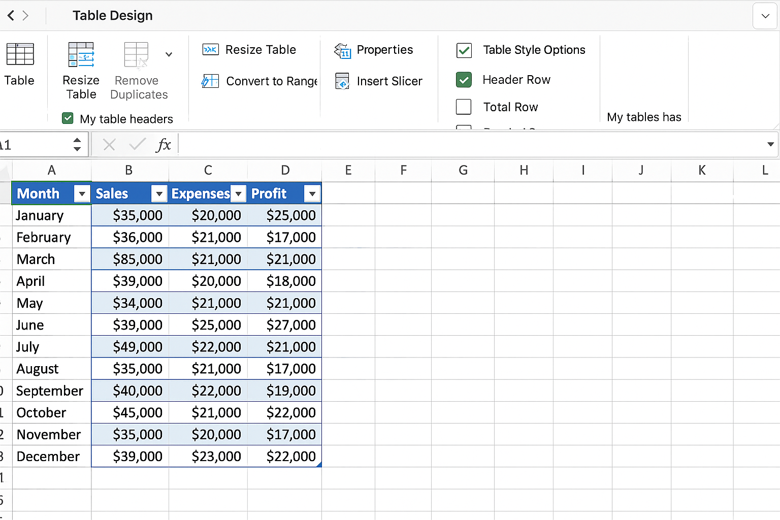
Step 2: Insert Tables for Better Data Management
Select your entire dataset (including headers).
- Go to the Insert tab on the Ribbon.
- Click on Table.
- Ensure that the “My table has headers” checkbox is selected.
- Click OK.
This converts your data range into an Excel Table, which makes data management easier and dynamic for your dashboard.
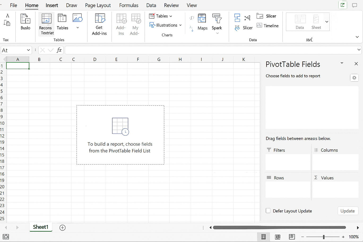
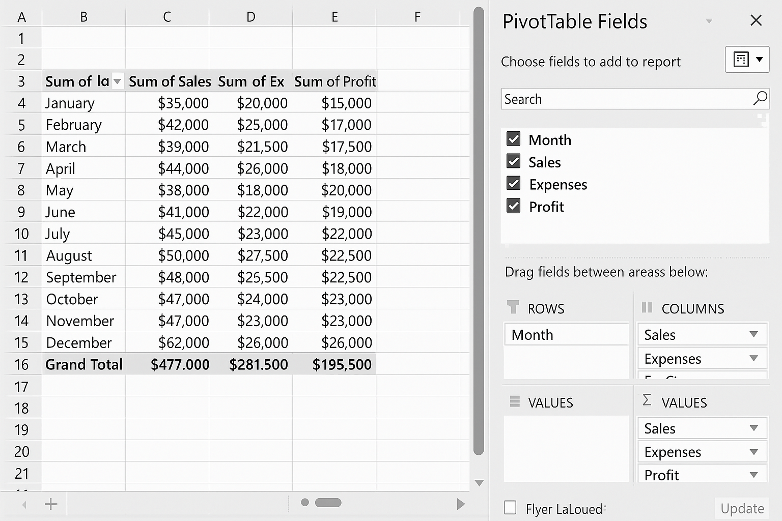
Step 3: Create Pivot Tables for Summary
Pivot tables allow you to summarize large datasets quickly and are essential for dashboards.
- Click anywhere inside your Excel Table.
- Go to the Insert tab and select PivotTable.
- In the dialog box, choose to place the PivotTable in a new worksheet and click OK.
- In the PivotTable Fields pane, drag Month to the Rows area.
- Drag Sales, Expenses, and Profit to the Values area.
This creates a summarized view of your data, which you can use in your dashboard visuals.
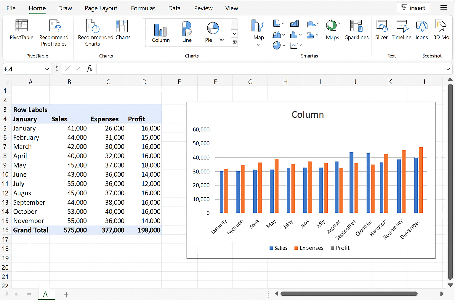
Step 4: Insert Charts Based on Pivot Table
Charts make dashboards visually appealing and easier to understand.
- Click inside your PivotTable.
- Go to the Insert tab.
- Select a chart type, for example, a Column Chart or Line Chart.
- The chart will be inserted and linked to your PivotTable data.
Resize and position your chart as needed. You can format the chart elements by clicking on chart components or using the Chart Tools on the Ribbon.
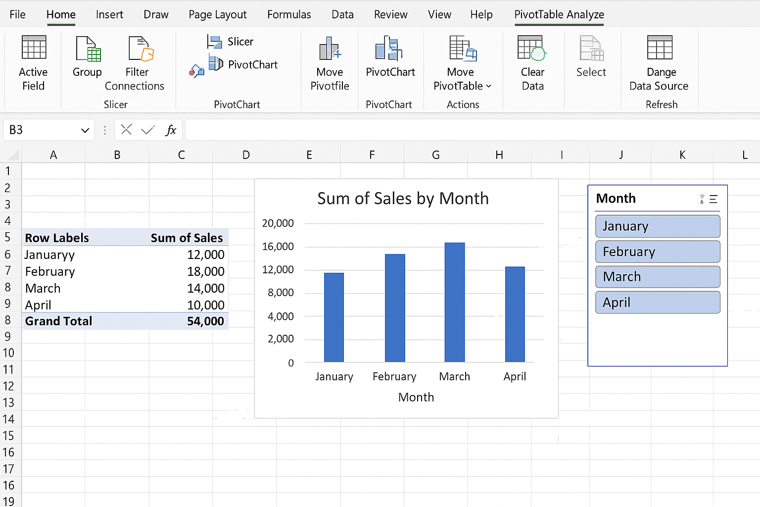
Step 5: Add Slicers for Interactivity
Slicers allow you to filter data easily in your dashboard.
- Click anywhere in your PivotTable.
- Go to the PivotTable Analyze tab.
- Click Insert Slicer.
- Select the fields you want to filter by, for example, Month.
- Click OK.
- Position the slicer beside your chart or pivot table.
- Click the slicer buttons to filter data dynamically.
Step 6: Design Your Dashboard Layout
Create a new worksheet and rename it Dashboard.
- Copy and paste your charts, pivot tables, and slicers onto this sheet.
- Arrange the elements logically—place slicers at the top or side for easy access.
- Add descriptive titles using text boxes: Go to the Insert tab > Text Box, and type titles like “Monthly Sales Overview”.
- Use consistent colors and fonts to enhance visual appeal.
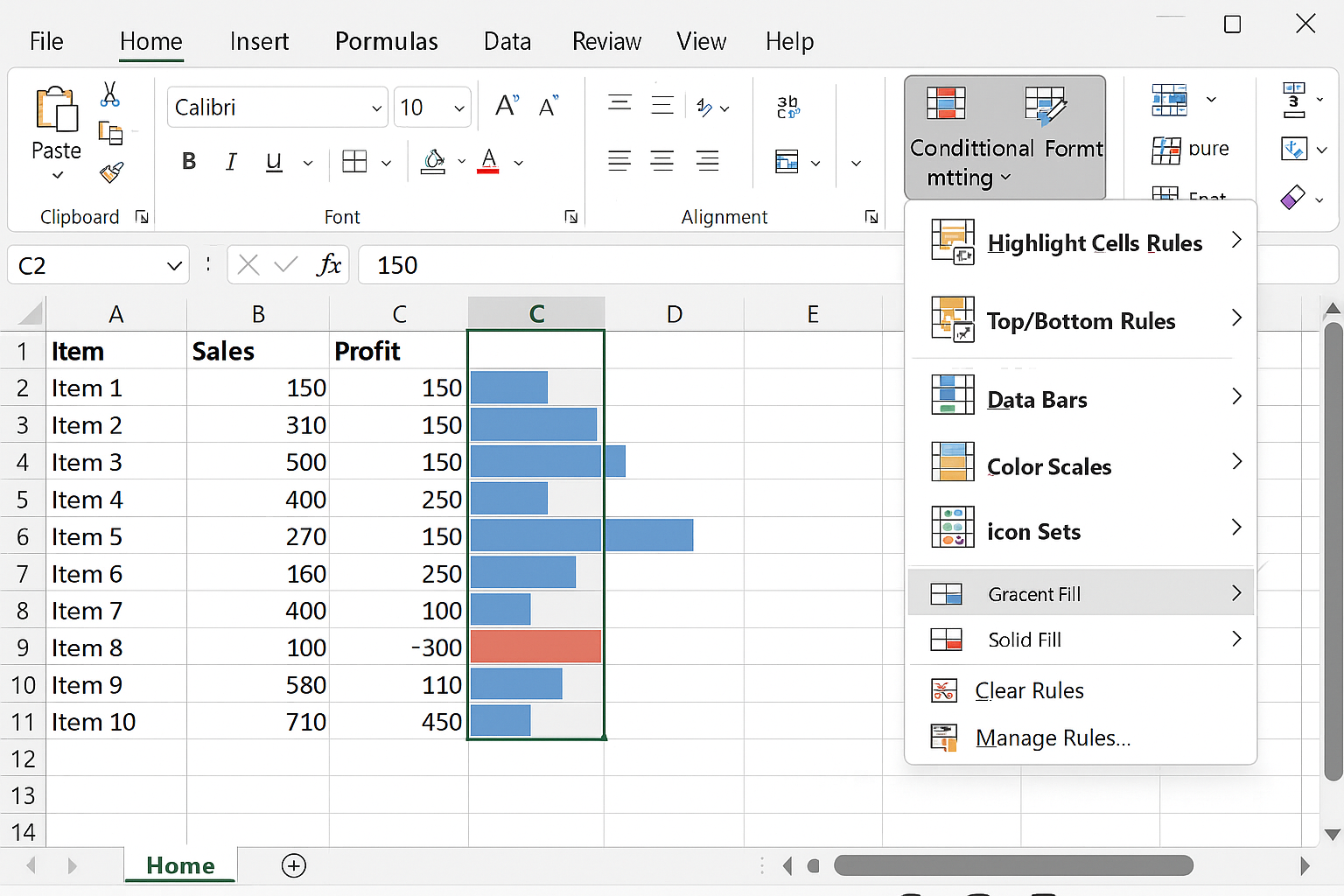
Step 7: Use Conditional Formatting for Data Highlights
Conditional formatting can make important data stand out.
- Select the data range you want to highlight (for example, the Profit column).
- Go to the Home tab.
- Click Conditional Formatting > Data Bars, or Color Scales.
- Choose a style that fits your dashboard design.
Step 8: Final Checks and Saving
- Test your slicers and filters to ensure the dashboard updates correctly.
- Save your workbook with a clear filename, e.g., “Sales Dashboard.xlsx”.
- Consider protecting the dashboard sheet: Right-click the Dashboard tab > Protect Sheet to prevent accidental edits.
Practical Example Summary
By following these steps, you will have a functional Excel dashboard that shows monthly sales, expenses, and profits with interactive filtering options. This dashboard helps you monitor key metrics at a glance and make informed business decisions.
FAQ
- What is an Excel dashboard?
- An Excel dashboard is a visual interface that displays key data metrics and trends using charts, tables, and interactive controls like slicers.
- Do I need advanced Excel skills to create dashboards?
- No, beginners can create dashboards by learning basic Excel features such as tables, pivot tables, charts, and slicers.
- Can I update my dashboard automatically?
- Yes, if your data source is updated within the Excel Table, the pivot tables and charts will refresh accordingly when you use the Refresh function.
- Which Excel version supports dashboards?
- Most Excel versions from 2013 onwards support dashboard features like PivotTables, slicers, and charts.
- How can I make my dashboard more interactive?
- Using slicers, timelines, and drop-down menus improve interaction and allow users to filter and explore data dynamically.
Conclusion
Creating a professional Excel dashboard is achievable even for beginners by following a structured approach. Organizing your data, summarizing with pivot tables, visualizing with charts, and adding interactive elements are key steps. With practice, you can build dashboards that provide valuable insights and enhance your data-driven decision-making.
Related Articles
- How to Build Excel Dashboards That Impress Stakeholders
- Key Components of an Effective Excel Dashboard
- Designing the Perfect Layout for Your Excel Dashboard
- Top Free Excel Dashboard Templates to Get Started Quickly
- How to Use Charts Effectively in Excel Dashboards
Want practical Excel help?
Support free Excel tutorials, get weekly tips, or contact us for Excel programming, VBA, Power Query, dashboards, and automation work.