How to Use Charts Effectively in Excel Dashboards

Introduction
Excel dashboards are powerful tools for visualizing data and making insightful business decisions. One of the key elements that bring dashboards to life is the effective use of charts. Excel dashboard charts allow users to quickly interpret trends, patterns, and key performance indicators (KPIs) at a glance. In this article, you will learn how to select, create, and customize charts in Excel dashboards to maximize their impact and clarity.
Why Use Charts in Excel Dashboards?
Charts transform raw data into visual stories, helping stakeholders understand complex data sets quickly. When used correctly, charts can highlight critical trends, compare data sets, and track progress over time.
- Visual Clarity: Charts make data easier to digest.
- Trend Identification: Quickly spot upward or downward trends.
- Comparison: Compare multiple metrics side-by-side.
- Engagement: Visual elements increase dashboard engagement.
Types of Excel Dashboard Charts
Choosing the right chart type depends on the data you want to display and the story you want to tell. Commonly used Excel dashboard charts include:
- Column and Bar Charts: Best for comparing categories.
- Line Charts: Ideal to show trends over time.
- Pie Charts: Useful for showing proportions within a whole.
- Area Charts: Highlight volume changes over time.
- Combo Charts: Combine two chart types to compare different data sets.
- Gauge Charts: Display KPIs like progress toward goals.
- Scatter Charts: Show relationships between variables.
Step-by-Step Guide: Creating Excel Dashboard Charts
Step 1: Prepare Your Data
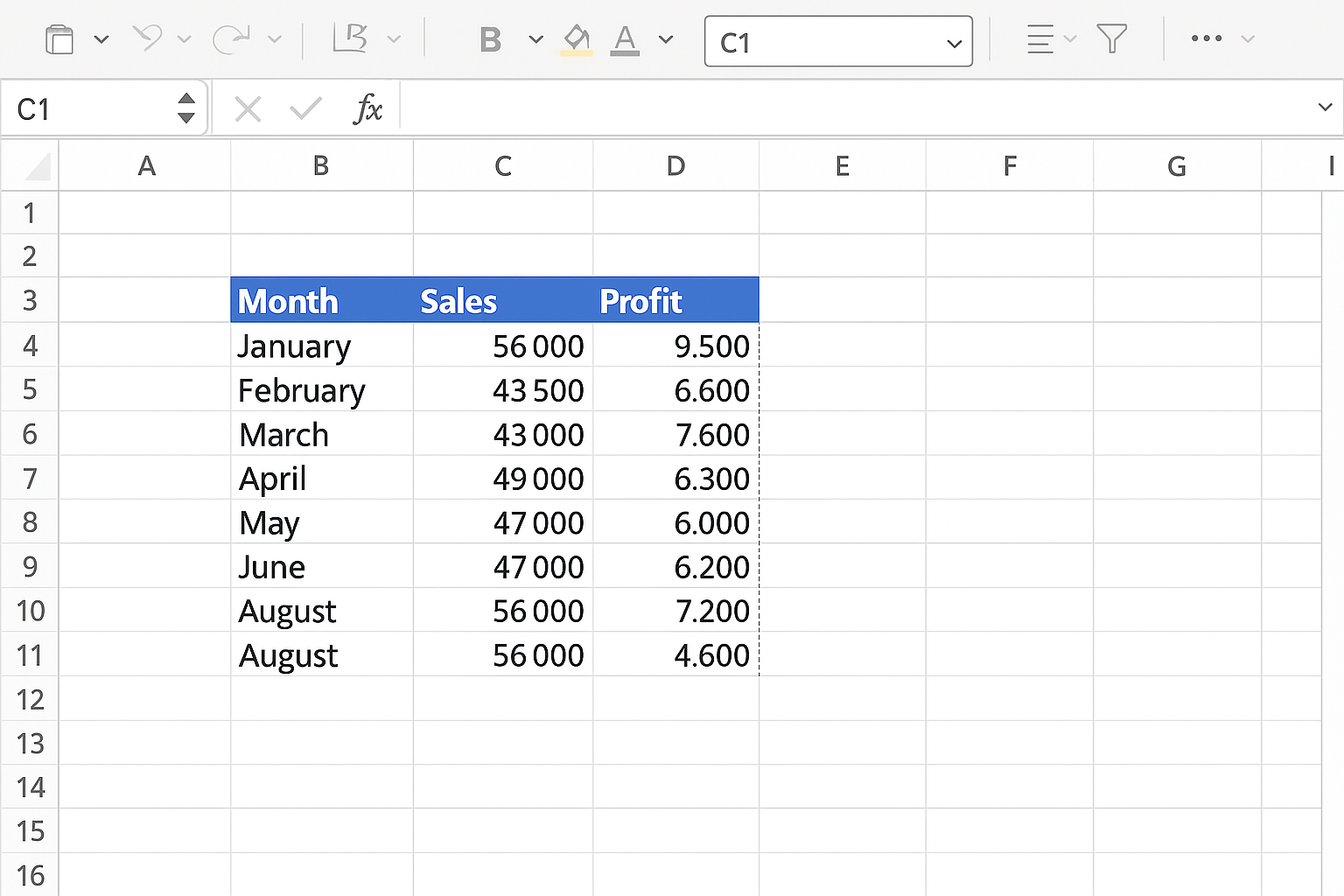
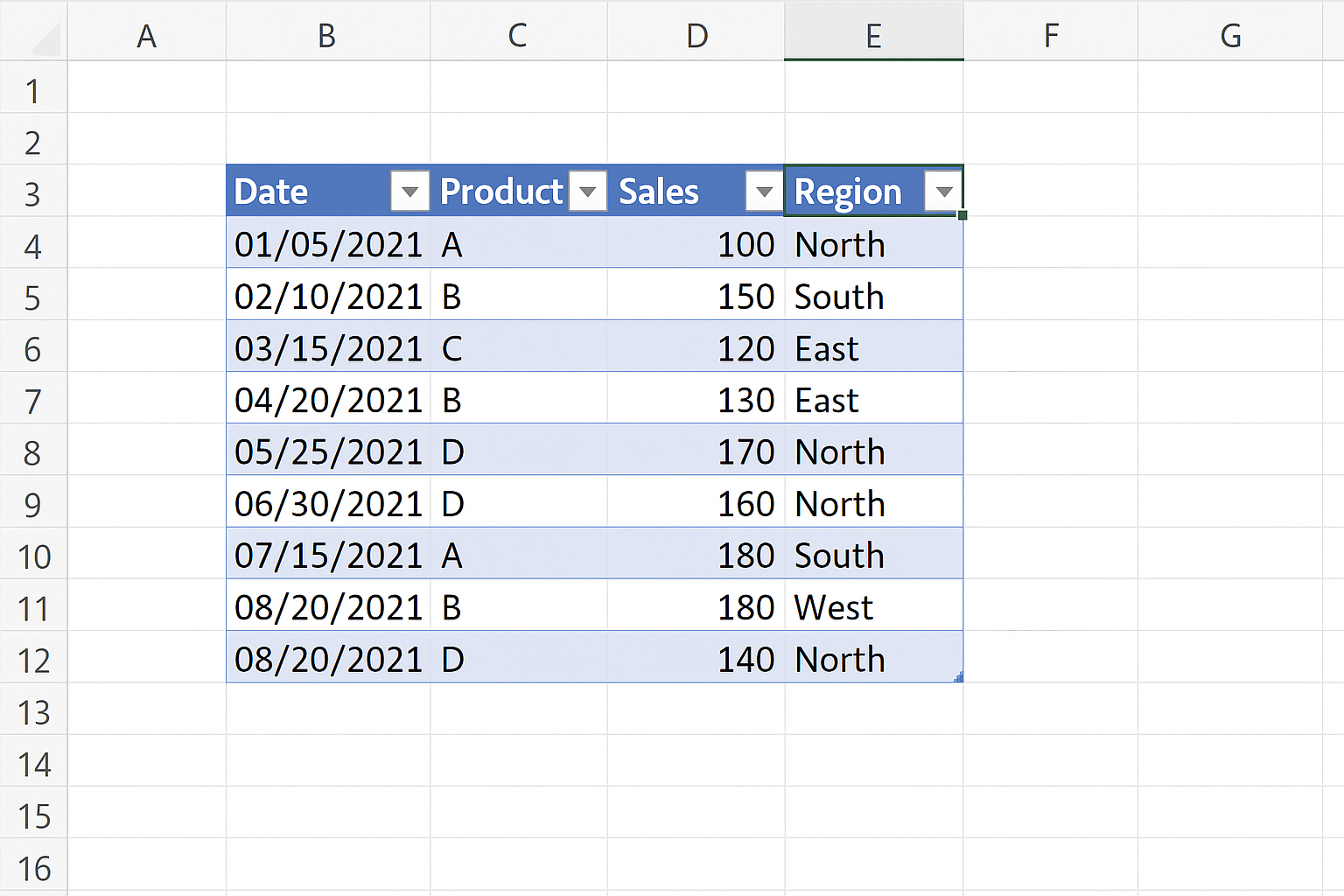
Ensure your data is organized in a tabular format with clear headers. For example, if you want to create a sales dashboard, your table might include columns like “Month,” “Sales,” and “Profit.”
Step 2: Insert a Chart
-
- Select the data you want to visualize, including headers.
-
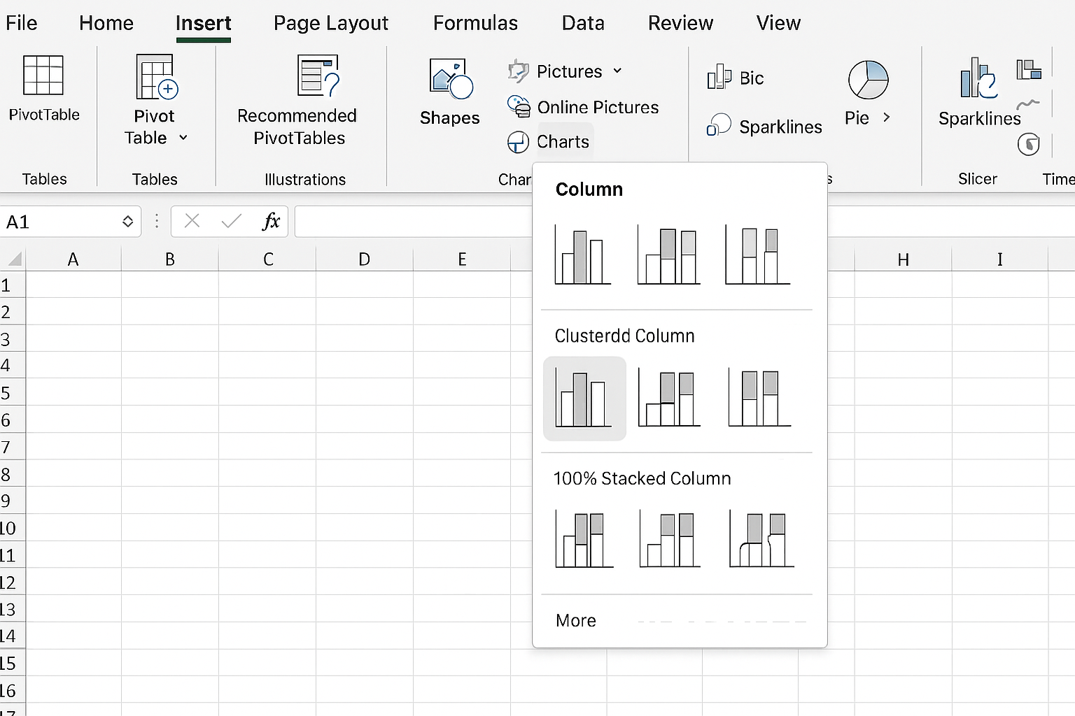
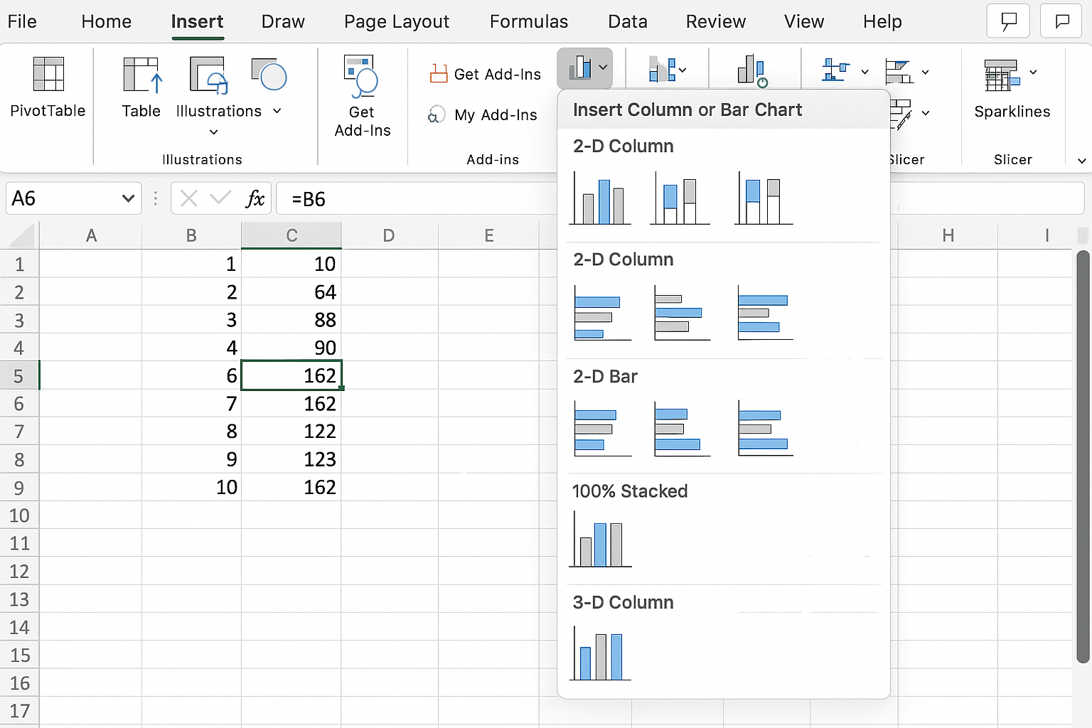
- Go to the Insert tab on the Excel ribbon.
-
- Click on the desired chart type, for example, Insert Column or Bar Chart and choose a specific style.
Step 3: Customize Chart Elements
After inserting the chart, customize it to improve readability and fit your dashboard style.
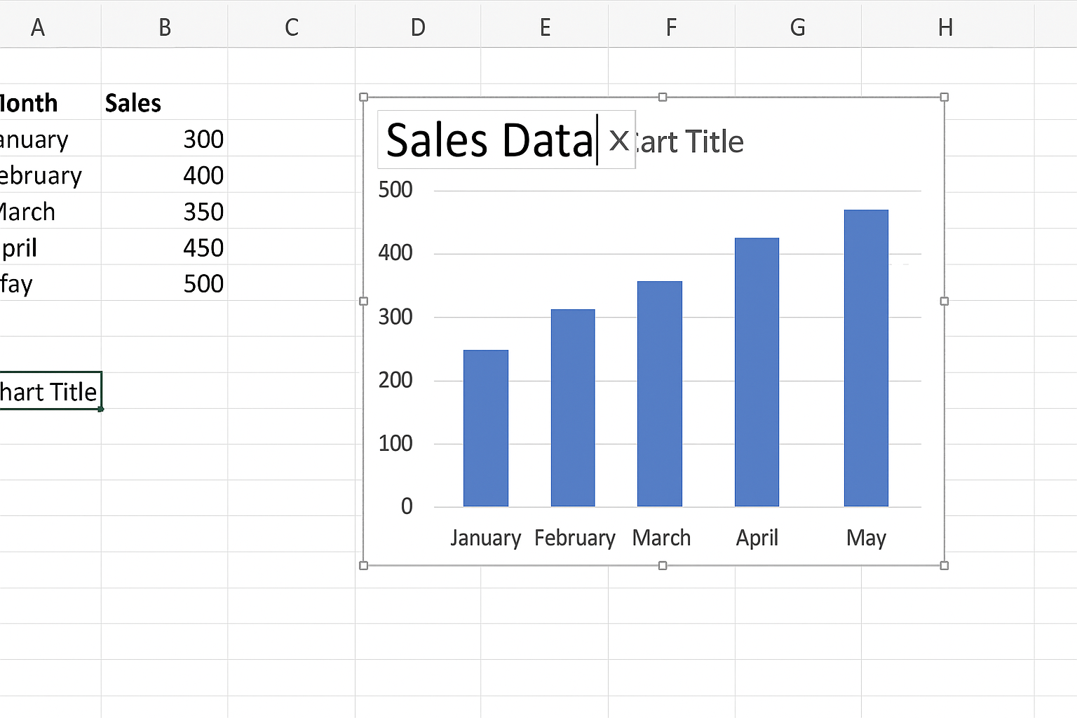
- Add or Edit Chart Title: Click on the default title and type a meaningful title.
- Adjust Axis Labels: Ensure axis labels clearly describe the data.
- Format Data Series: Right-click on data series to change colors or styles for better distinction.
- Legend Placement: Move or remove the legend for cleaner visuals.
Step 4: Resize and Position the Chart
Drag the chart corners to resize it so it fits well within your dashboard layout. Position it next to related data or KPIs for clarity.
Step 5: Use Dynamic Data with Named Ranges or Tables
To make your dashboard charts update automatically with new data:
-
- Format your data as an Excel Table by selecting the data range and pressing Ctrl + T.
- When you add new rows, charts will update dynamically.
Practical Example: Creating a Sales Performance Dashboard Chart
Let’s create a line chart showing monthly sales performance.
-
- Organize your data in two columns: Month (e.g., Jan, Feb, Mar) and Sales (numeric values).
- Select the data range including headers.
- Go to the Insert tab and click Insert Line Chart > Line with Markers.
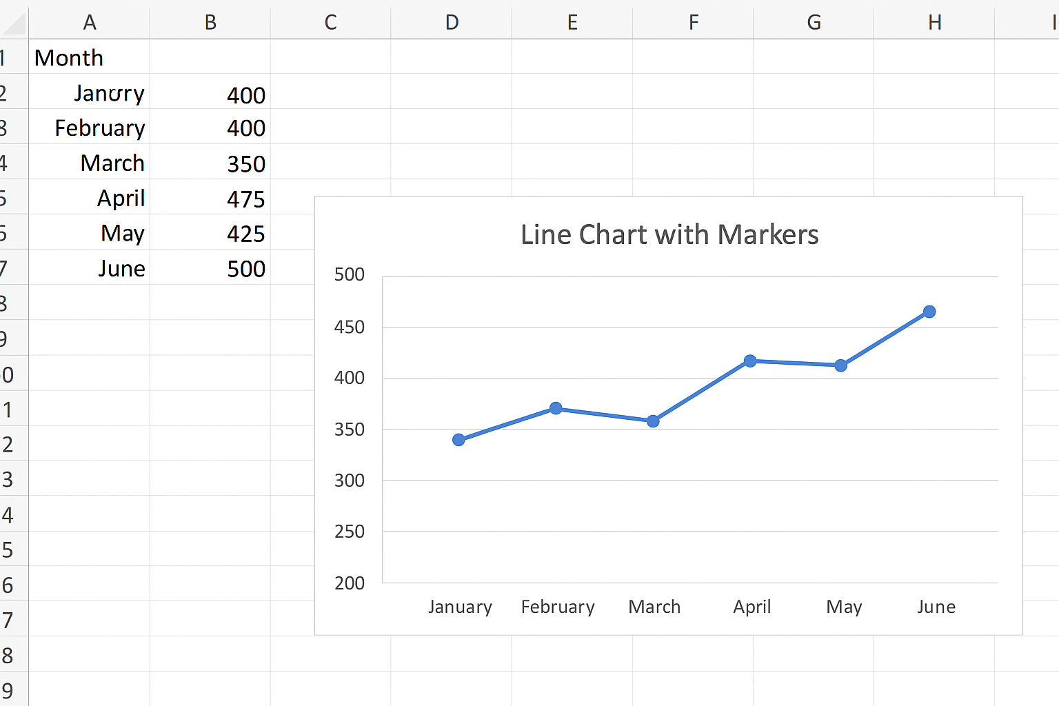
- Click on the chart title and rename it to “Monthly Sales Performance.”
- Right-click the vertical axis and select Format Axis to set appropriate minimum and maximum values for better visualization.
- Use the Chart Styles button to apply a sleek design.
Tips for Using Excel Dashboard Charts Effectively
- Keep It Simple: Avoid clutter by limiting chart elements and focusing on key metrics.
- Use Consistent Colors: Apply a color scheme that aligns with your brand or dashboard theme.
- Label Clearly: Ensure all axes, legends, and titles are easy to understand.
- Leverage Conditional Formatting: Highlight critical values or trends directly in charts.
- Use Interactive Elements: Incorporate slicers and filters to let users drill down into data.
Common Mistakes to Avoid
- Overloading Charts: Too many data series can confuse viewers.
- Inappropriate Chart Types: Avoid using pie charts for complex data comparisons.
- Ignoring Data Updates: Forgetting to make charts dynamic can lead to outdated dashboards.
- Poor Labeling: Missing or vague labels reduce comprehension.
Conclusion
Excel dashboard charts are essential for turning raw data into meaningful insights. By choosing the right chart types, customizing elements thoughtfully, and following best practices, you can create dashboards that communicate data clearly and effectively. Remember to keep your charts simple, dynamic, and relevant to your audience for maximum impact.
Frequently Asked Questions (FAQs)