How to Format Pivot Tables for Better Visual Appeal and Clarity
Introduction
Pivot tables are one of Excel’s most powerful features, allowing users to efficiently summarize and analyze large data sets. However, a poorly formatted pivot table can be difficult to read and interpret, diminishing its value. Properly formatting your pivot tables enhances both their visual appeal and clarity, making it easier to extract insights and present data professionally.
In this article, we will explore practical techniques to format pivot tables in Excel. We will cover essential formatting tips, customization options, and provide clear examples to help you create pivot tables that are not only functional but visually engaging.
Why Format Pivot Tables?
Formatting pivot tables improves:
- Readability: Well-spaced, aligned, and color-coded tables reduce eye strain and make it easier to track data points.
- Data clarity: Highlights important figures and trends, enabling quick analysis.
- Presentation: Clean and professional-looking tables enhance reports and presentations.
Step-By-Step Guide to Format Pivot Tables
1. Apply Built-in Pivot Table Styles
Excel offers a range of pre-designed pivot table styles that instantly improve the table’s look.
Example:
- Click anywhere inside the pivot table.
- Go to the PivotTable Tools Design tab on the Ribbon.
- In the PivotTable Styles group, hover over different styles to preview.
- Select a style that fits your desired look, such as “Medium” or “Dark” themes.
These styles apply background colors, font formatting, and borders to your pivot table for better visual distinction.
2. Use Banding for Rows and Columns
Banding alternates row or column shading to help differentiate data lines.
How to enable banding:
- Click inside the pivot table.
- Under the Design tab, check the boxes for Row Headers and Column Headers.
- Enable Banded Rows or Banded Columns as needed.
This technique makes scanning large tables easier.
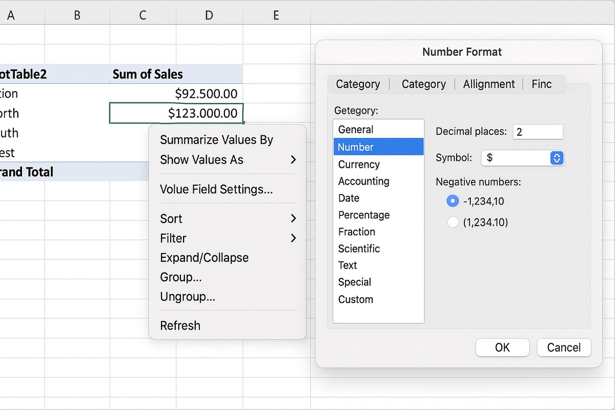
3. Customize Number Formats
Formatting numbers correctly improves understanding of data types such as currency, percentages, or dates.
Example: Format sales figures as currency.
- Right-click on a value field in the pivot table.
- Select Value Field Settings.
- Click Number Format at the bottom left.
- Choose the appropriate format like Currency or Percentage.
- Click OK to apply.
4. Adjust Column Widths and Row Heights
Ensure data fits well within cells without excessive white space or truncation.
Tip: Double-click the right edge of a column header to auto-adjust width based on content.
5. Add Clear and Descriptive Headers
Headers should be concise yet informative. Rename field headers if necessary for clarity.
How to rename:
- Click on the header label inside the pivot table.
- Type the new header name and press Enter.
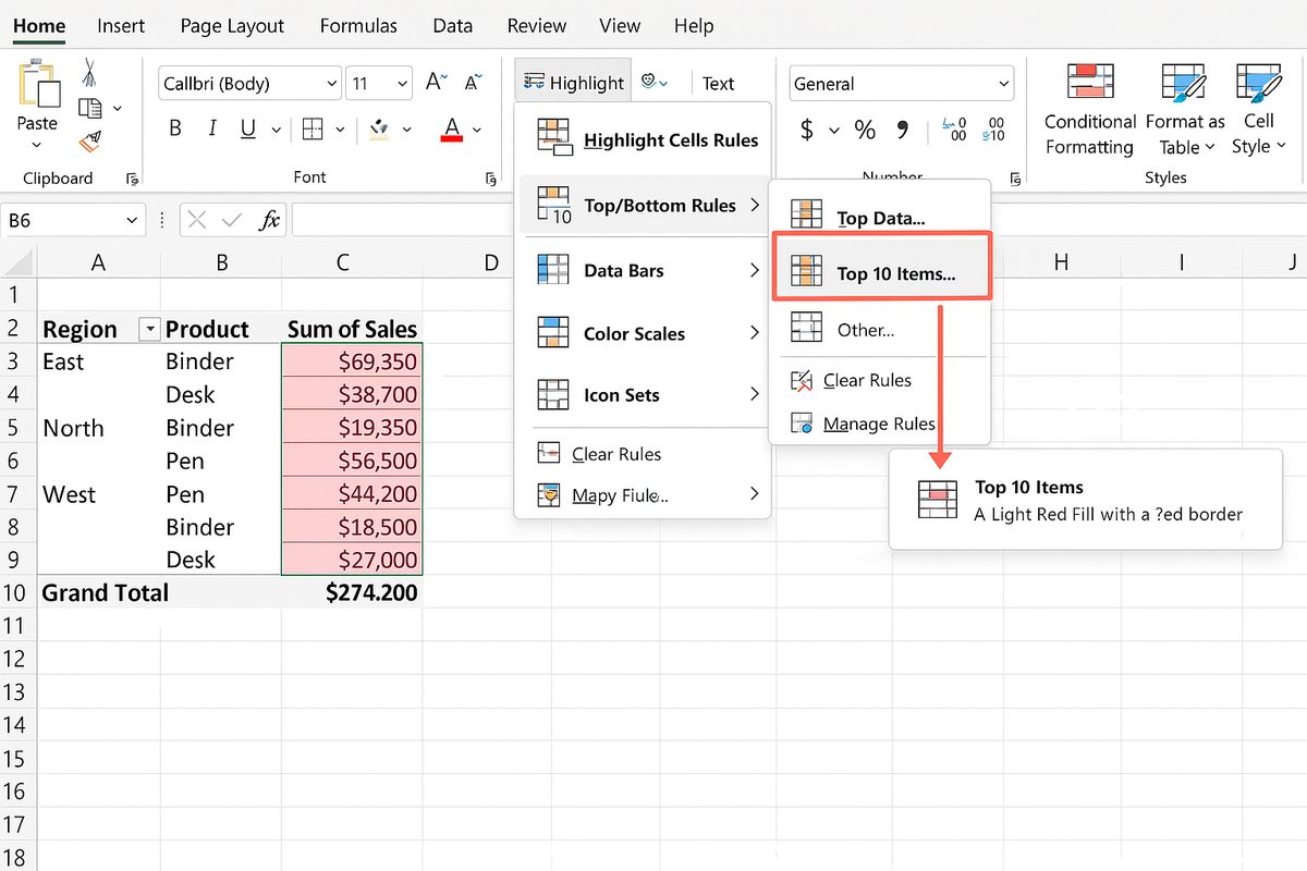
6. Use Conditional Formatting
Conditional formatting helps highlight important data trends such as highest values or specific ranges.
Example: Highlight top 10 sales values.
- Select the data cells inside the pivot table.
- Go to the Home tab, click Conditional Formatting.
- Choose Top/Bottom Rules > Top 10 Items.
- Set the formatting style (e.g., fill color) and click OK.
7. Group Data for Better Organization
Grouping related data segments can improve readability and analysis.
Example: Group dates by month or quarters.
- Right-click on a date field in the pivot table.
- Select Group.
- Choose grouping options such as Months, Quarters, or Years.
- Click OK.
8. Remove Unnecessary Subtotals and Grand Totals
Sometimes subtotals or grand totals clutter the table and distract from key results.
How to remove:
- Click inside the pivot table.
- Under the Design tab, click Subtotals and select Do Not Show Subtotals.
- Similarly, click Grand Totals and choose Off for Rows and Columns if totals are unnecessary.
9. Use Slicers and Filters for Interactive Formatting
Slicers provide user-friendly buttons to filter pivot table data dynamically.
To add a slicer:
- Click inside the pivot table.
- Go to PivotTable Analyze tab and select Insert Slicer.
- Choose the fields you want slicers for.
- Click OK and position slicers next to your pivot table.
Interactive formatting helps focus on specific data subsets.
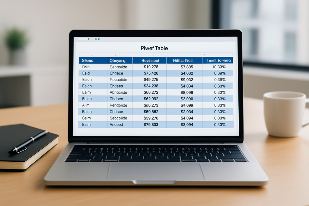
Practical Example: Formatting a Sales Pivot Table
Imagine a pivot table summarizing sales data by region and product with sales figures.
To format:
- Apply a medium blue style for a professional look.
- Enable banded rows for easy row distinction.
- Format sales figures as currency with two decimal places.
- Auto-fit column widths.
- Rename “Sum of Sales” to “Total Sales” for clarity.
- Add conditional formatting to highlight the top 5 highest sales.
- Group dates by quarters if there is a date field.
- Remove grand totals if focusing on regional sales comparison only.
Conclusion
In Excel, formatting pivot tables significantly boosts their usability and presentation quality. By applying built-in styles, customizing number formats, using banding, and adding interactive slicers, you create pivot tables that are both visually appealing and easier to interpret. These enhancements help you communicate data insights more effectively and make your reports stand out.
Remember, the key is balancing clarity with aesthetics—avoid over-formatting that can distract rather than assist. Use the techniques discussed here to format your pivot tables confidently and transform raw data into meaningful visual stories.
Related Articles
- Pivot Tables Tutorial: A Beginner’s Guide to Summarizing Data
- What Is a Pivot Table and How Can It Help You Analyze Data?
- How to Create a Pivot Table in Excel Step-by-Step
- Understanding Pivot Table Fields: Rows, Columns, Filters, and Values Explained
- Advanced Pivot Table Techniques to Master Data Analysis
Want practical Excel help?
Support free Excel tutorials, get weekly tips, or contact us for Excel programming, VBA, Power Query, dashboards, and automation work.