Key Components of an Effective Excel Dashboard

Introduction
Creating an effective Excel dashboard is essential for visualizing data, making informed decisions, and tracking performance metrics efficiently. A well-designed dashboard not only displays data but also tells a story through interactive and easy-to-understand visuals. In this article, we will explore the key excel dashboard components that every dashboard should have to maximize its impact and usability.
1. Clear and Concise Title
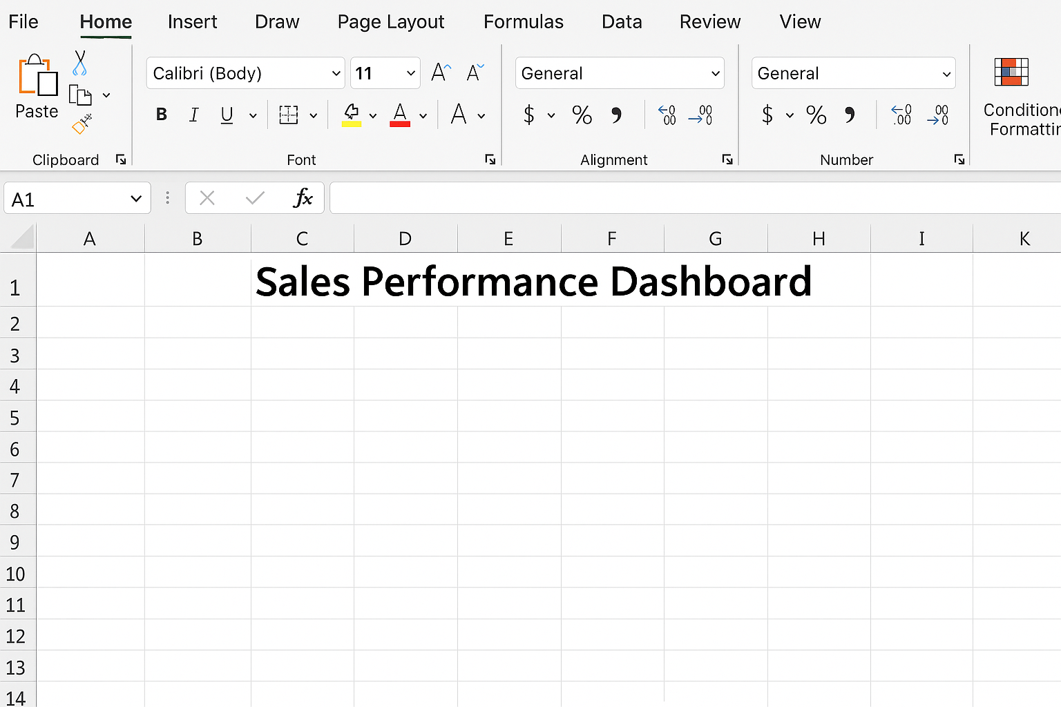
The first and simplest component of an effective Excel dashboard is a clear title that explains what the dashboard represents. This helps users quickly understand the focus of the dashboard.
Example: Place the title in cell A1, merge cells A1 to F1, and set the font size to 18 with bold formatting.
Steps:
- Click cell A1.
- Type “Sales Performance Dashboard”.
- Highlight cells A1:F1.
- Click Merge & Center from the Home tab.
- Increase font size to 18 and set it to bold.
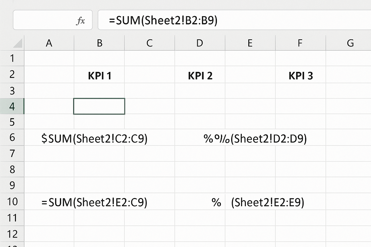
2. Key Performance Indicators (KPIs)
KPIs are vital numeric metrics that summarize critical data points. They should be displayed prominently to give users a quick snapshot of performance.
Example KPIs: Total Sales, Monthly Revenue, Customer Growth, Profit Margin.
Steps to add KPIs:
- Choose cells B3, D3, F3, and H3 for KPI values.
- Label each KPI in the row above (B2, D2, F2, H2).
- Use formulas such as
=SUM(SalesData!C2:C100)to calculate totals. - Format KPI numbers with currency or percentage formats using the Number Format dropdown.
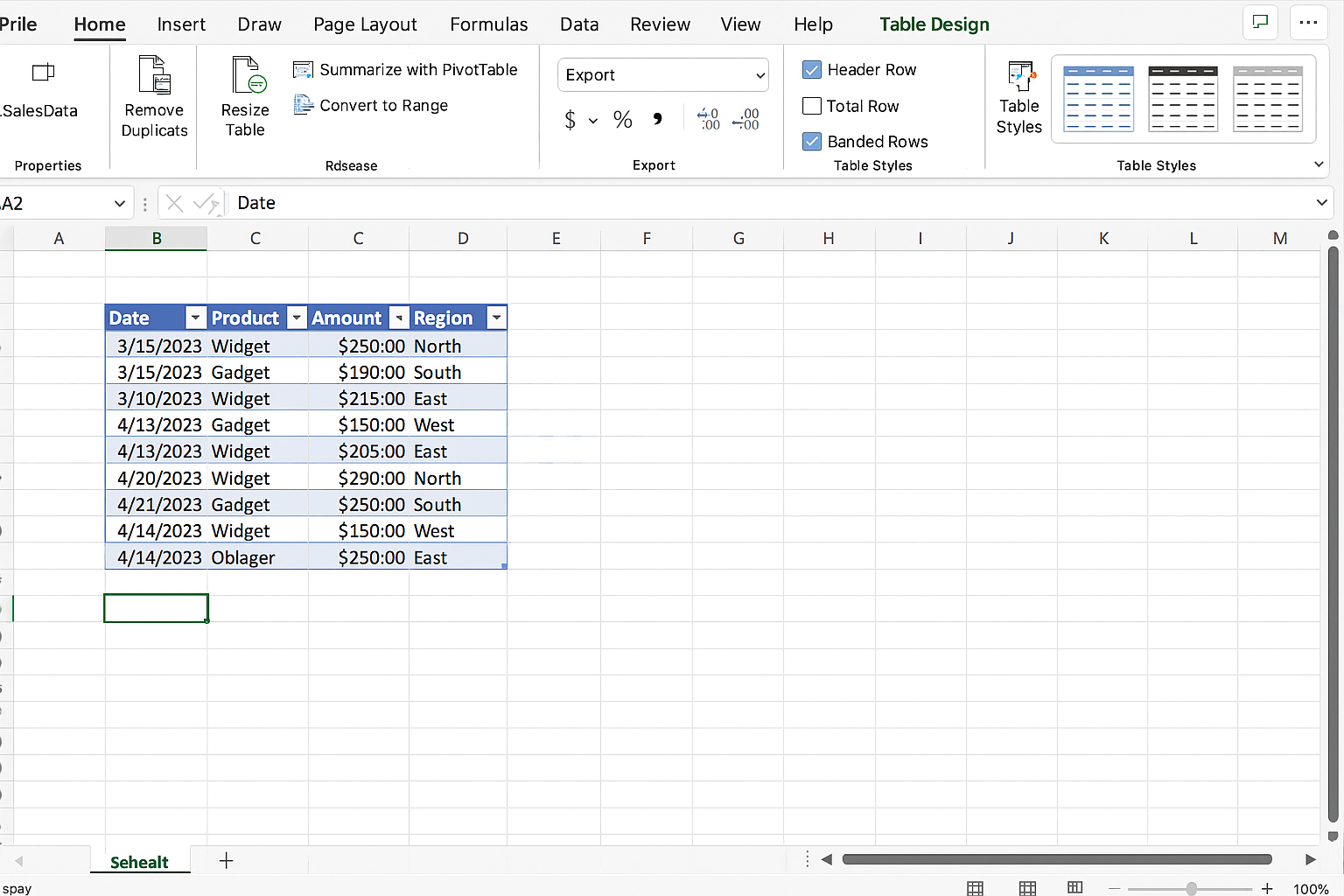
3. Data Tables
Underlying data tables provide the raw numbers and details that dashboards summarize. Organize data in Excel tables to enable filtering and dynamic charting.
Steps to create a data table:
- Highlight your raw data range.
- Go to the Insert tab and click Table.
- Ensure “My table has headers” is checked and click OK.
- Name your table under Table Design (e.g., SalesData).
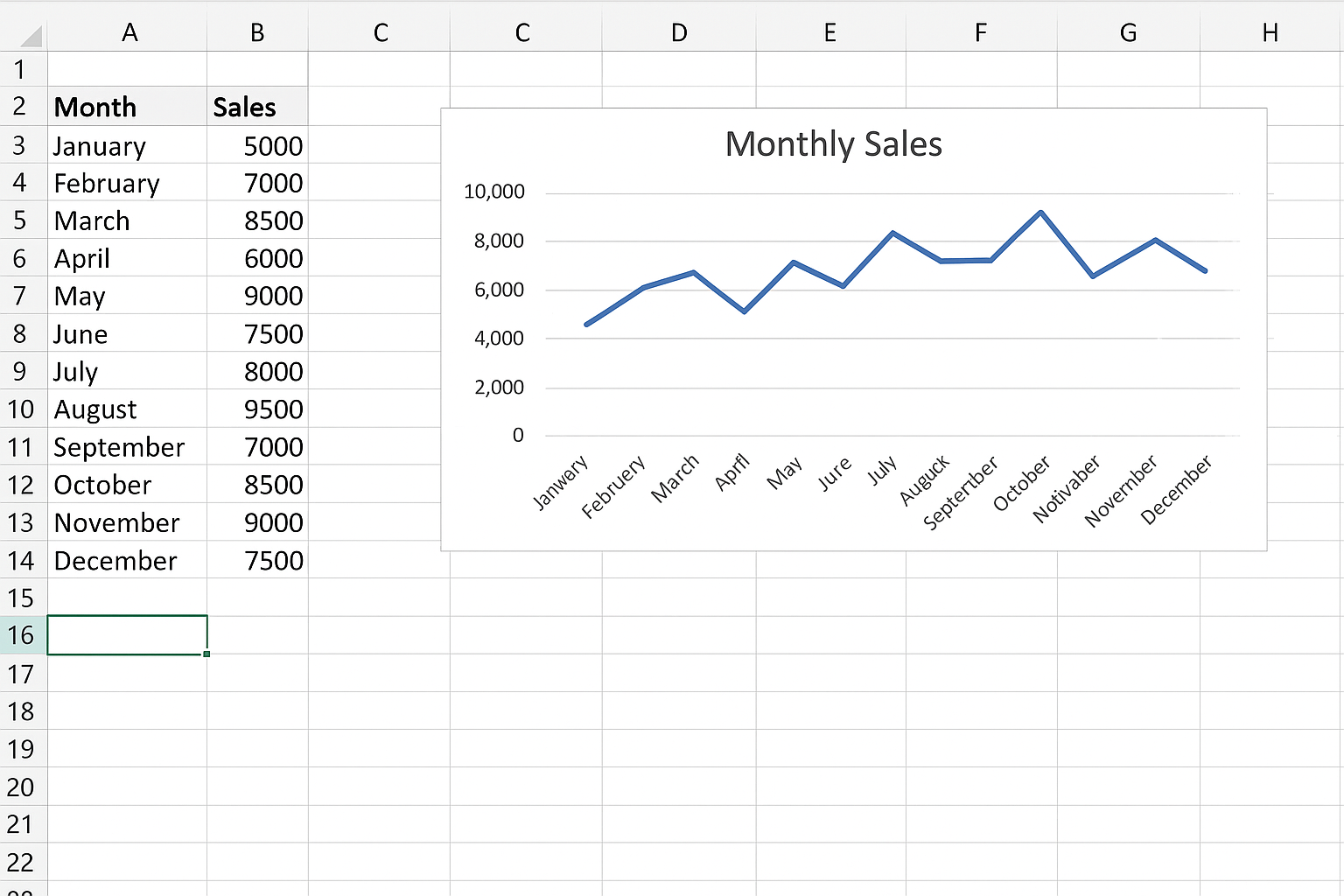
4. Interactive Charts and Graphs
Visual charts such as bar charts, pie charts, line graphs, and gauges transform numbers into visuals that are easier to interpret.
Example: To show monthly sales trends, a line chart is effective.
Steps to insert a line chart:
- Select the sales data for the months.
- Go to the Insert tab, click Line Chart, and choose the desired style.
- Position the chart on the dashboard sheet.
- Use design tools to add chart titles and format axes.
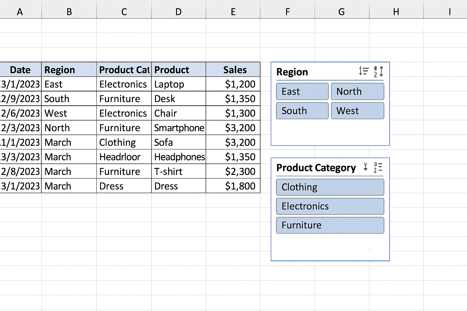
5. Slicers and Filters
Interactivity is crucial in dashboards. Slicers and filters allow users to drill down into specific data segments without modifying the raw data.
Steps to add slicers:
- Click anywhere inside your Excel table.
- Go to the Table Design tab and click Insert Slicer.
- Select fields like “Region” or “Product Category” for filtering.
- Position slicers on the dashboard for easy access.
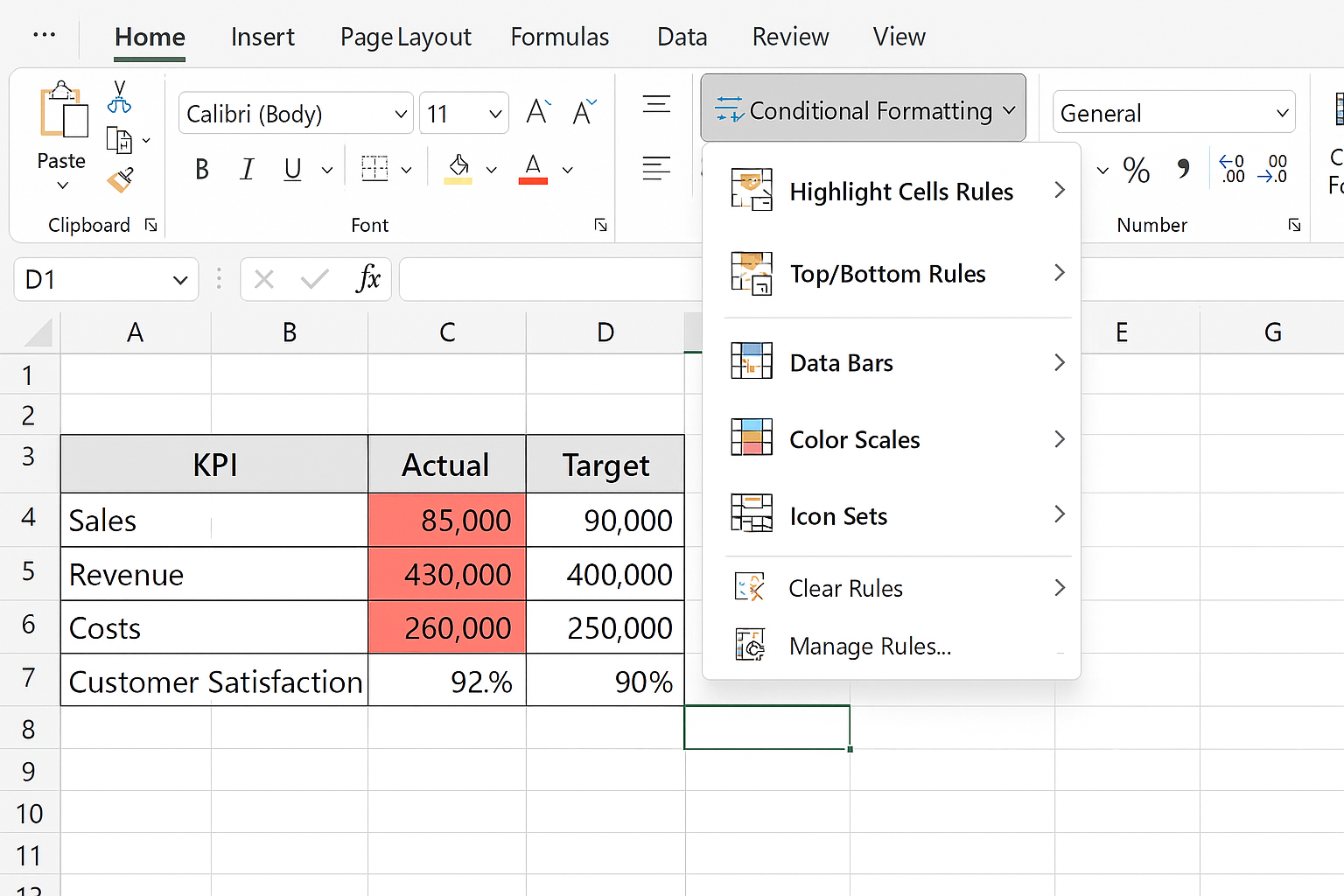
6. Conditional Formatting
Conditional formatting helps highlight trends and exceptions by changing cell colors based on values.
Example: Highlight sales values below target in red.
Steps:
- Select the KPI or data range.
- Go to the Home tab, click Conditional Formatting > Highlight Cell Rules > Less Than.
- Enter the target value and choose a formatting style (e.g., red fill).
7. Clear Layout and Design
A cluttered dashboard confuses users. Use white space effectively, align elements properly, and group related components.
Tips:
- Use gridlines sparingly.
- Group related charts and KPIs near each other.
- Use consistent fonts and colors.
- Apply borders or background shading to separate sections.
8. Dynamic Text and Labels
Dynamic labels that update based on selected filters or data make dashboards more intuitive.
Example: Display the selected month in a cell using a formula linked to slicer selections.
Steps:
- Use the
GETPIVOTDATAorINDEX/MATCHfunctions to extract filtered values. - Display the extracted value in a cell above or beside charts.
Practical Example: Building a Simple Sales Dashboard
Let’s put these components into action by building a basic sales dashboard.
- Prepare data: Collect monthly sales data with columns for Month, Region, Product, and Sales.
- Create an Excel table: Select data > Insert > Table.
- Add KPIs: Use
=SUMIFSformulas to calculate total sales and monthly sales. - Insert charts: Create a column chart for sales by product and a line chart for sales trend.
- Add slicers: Insert slicers for Region and Product.
- Apply conditional formatting: Highlight sales below target.
- Design layout: Arrange KPIs at the top, charts below, slicers to the side.
Conclusion
Building an effective Excel dashboard requires the right combination of excel dashboard components such as clear titles, KPIs, tables, charts, interactivity, and thoughtful design. By following these guidelines and practical steps, you can create dashboards that are both visually appealing and highly functional, enabling better data-driven decision making.
Related Articles
- Step-by-Step Excel Dashboard Tutorial for Beginners
- How to Build Excel Dashboards That Impress Stakeholders
- Designing the Perfect Layout for Your Excel Dashboard
- Top Free Excel Dashboard Templates to Get Started Quickly
- How to Use Charts Effectively in Excel Dashboards
Want practical Excel help?
Support free Excel tutorials, get weekly tips, or contact us for Excel programming, VBA, Power Query, dashboards, and automation work.