Designing the Perfect Layout for Your Excel Dashboard
Introduction
Creating an effective Excel dashboard layout is crucial for presenting data in a clear, concise, and visually appealing manner. A well-designed dashboard allows users to quickly interpret the data and make informed decisions. In this article, we’ll explore key principles and practical steps to design the perfect layout for your Excel dashboard, helping you transform raw data into insightful visual stories.
Understanding the Basics of Excel Dashboard Layout
An Excel dashboard layout refers to the arrangement of charts, tables, key performance indicators (KPIs), and other visual elements on a single sheet. The goal is to make the dashboard intuitive and easy to navigate. Key elements to consider include data hierarchy, spacing, alignment, and color coding.
Key Elements of an Effective Layout
- Clarity: Avoid clutter and focus on critical data points.
- Consistency: Use consistent colors, fonts, and sizes.
- Logical Flow: Arrange information in a sequence that matches the user’s thought process.
- Visual Hierarchy: Highlight the most important metrics using size, color, or position.
- Interactivity: Incorporate filters or slicers for dynamic data exploration.
Step-by-Step Guide to Designing Your Excel Dashboard Layout
Step 1: Plan Your Dashboard Structure
Before opening Excel, outline what data you want to display and who the target audience is. Sketch a wireframe or list the key metrics and visuals. Decide on the number of sections or panels your dashboard will have.
Step 2: Set Up Your Excel Worksheet
Open a new Excel workbook and create a dedicated sheet for the dashboard. Rename it to “Dashboard” for easy reference.
Tip: Freeze panes (View > Freeze Panes) to keep headers visible while scrolling.
Step 3: Define a Grid Layout
Use Excel’s grid system to align elements neatly.
-
- Select multiple columns (for example, A to H) and right-click the column headers to set a uniform width (e.g., 15).
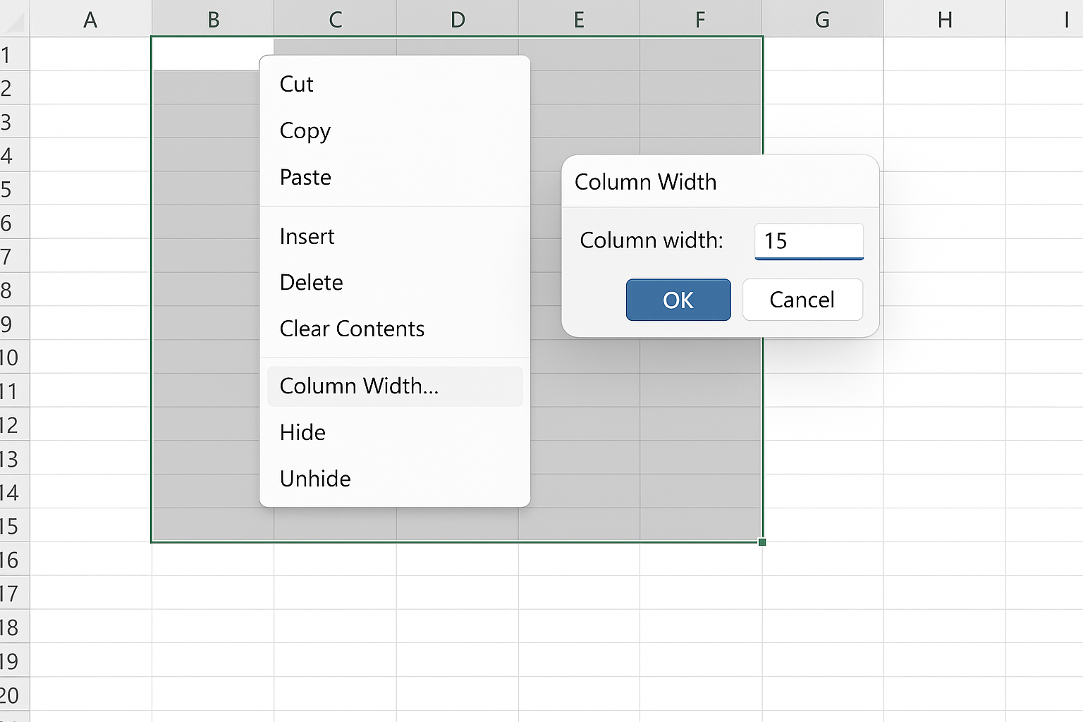
- Similarly, adjust row heights (e.g., to 25) by selecting rows and right-clicking.
- Enable gridlines via View > Gridlines if needed, or consider hiding them for a cleaner look.
Step 4: Insert and Arrange Visual Elements
Start adding charts, tables, and KPIs based on your plan.
For example, to insert a chart:
-
- Highlight your data range.
- Go to Insert > Charts and choose the appropriate chart type (e.g., Column, Line, Pie).
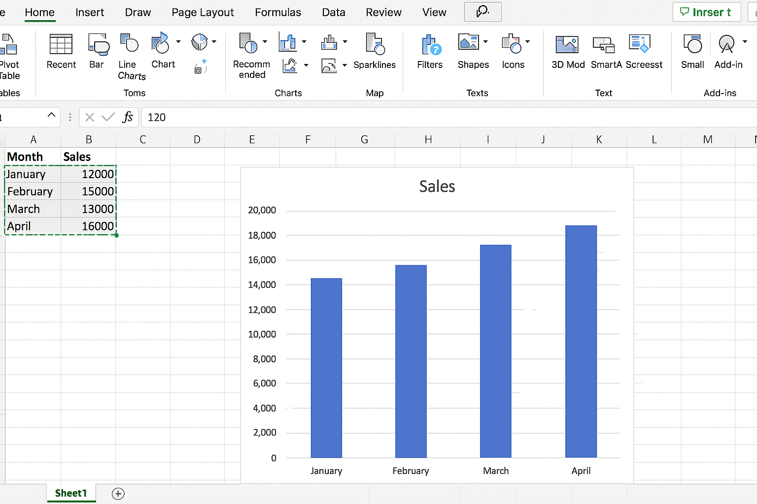
- Position the chart in the designated area of your grid layout.
Use the Format tab to align and size charts uniformly.
Step 5: Use Named Ranges and Dynamic Data
To make your dashboard dynamic, create named ranges:
-
- Highlight your data range.
- Go to Formulas > Define Name.
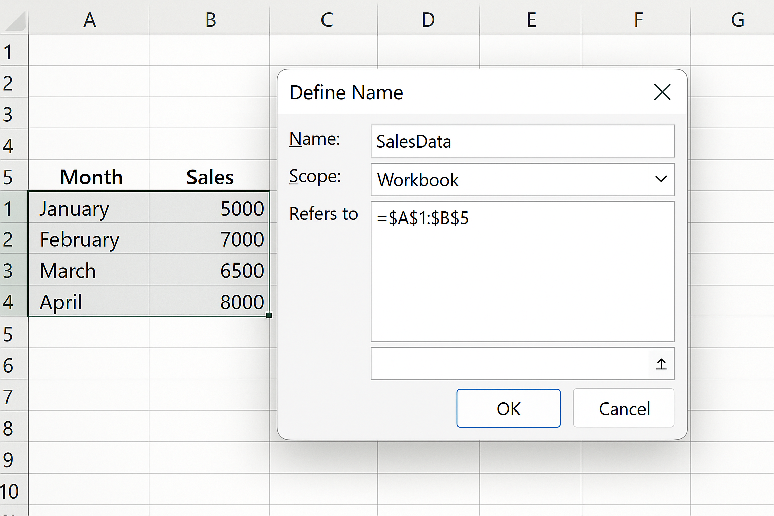
- Enter a meaningful name (e.g., “SalesData”).
Use these named ranges in your charts and formulas so the dashboard updates automatically when data changes.
Step 6: Add Interactive Controls
Incorporate slicers or drop-down menus to filter data:
-
- Click on a Pivot Table or Table linked to your dashboard.
- Go to Insert > Slicer.
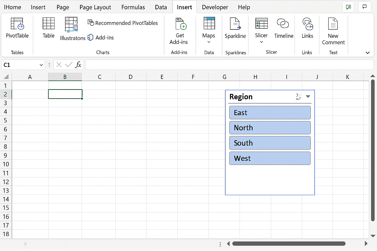
- Select the fields you want to filter by (e.g., Region, Product).
- Position slicers neatly within your layout.
Example: Add a slicer for “Region” to allow users to view sales by different regions dynamically.
Step 7: Apply Consistent Formatting and Color Schemes
Choose a color palette that aligns with your brand or is easy on the eyes.
-
- Use Conditional Formatting (Home > Conditional Formatting) to highlight key values such as high sales or low inventory.
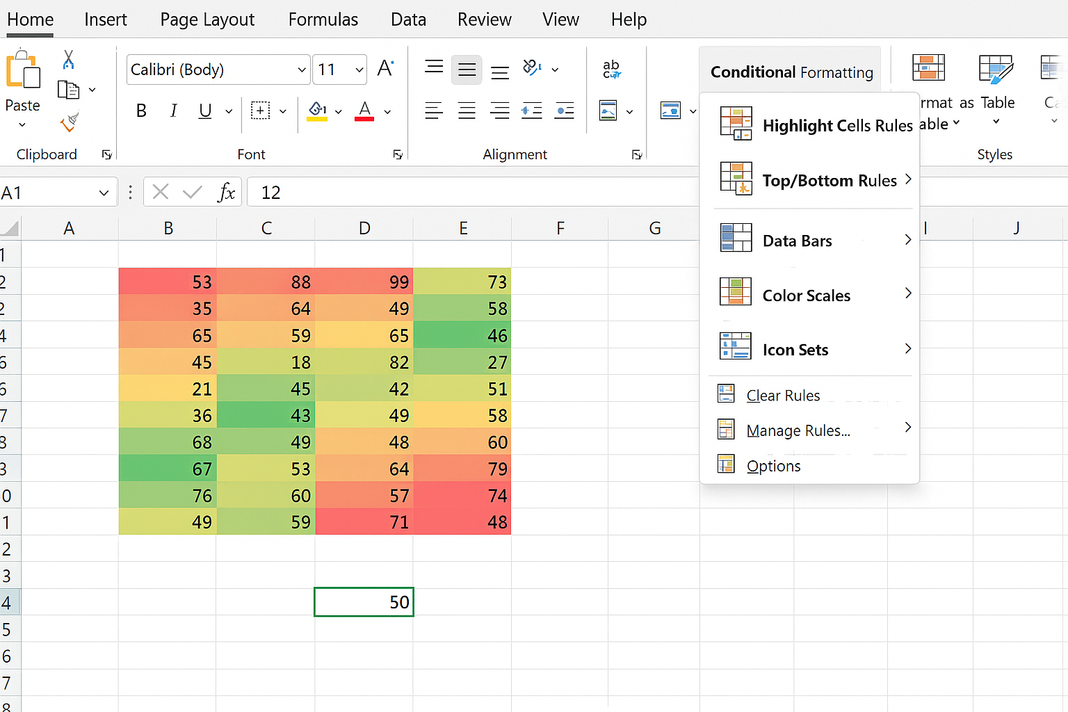
- Apply consistent font styles and sizes for titles, labels, and data.
- Use borders and shading subtly to separate sections without clutter.
Step 8: Add Titles and Labels
Clear titles help users understand each section quickly.
- Insert text boxes (Insert > Text Box) for descriptive titles.
- Use meaningful labels on charts and tables.
- Consider adding a dashboard header with the report title and date.
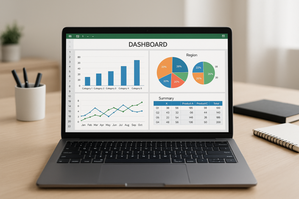
Practical Example: Creating a Sales Dashboard Layout
Imagine you have monthly sales data for different products and regions. Here’s how you might arrange your dashboard:
- Top Left: KPIs showing total sales, average order value, and growth rate.
- Top Right: A line chart displaying sales trends over the last 12 months.
- Bottom Left: A bar chart comparing sales across regions.
- Bottom Right: A table listing top 10 products by sales volume.
- Side Panel: Slicers for Region and Product Category to filter all visuals.
By following the steps above, you would set column widths and row heights to accommodate these elements, insert charts and slicers, and apply consistent formatting.
Tips for Optimizing Your Excel Dashboard Layout
- Keep It Simple: Avoid overloading your dashboard with too many visuals.
- Use White Space: Allow breathing room between elements for better readability.
- Focus on User Needs: Tailor the layout to what your audience needs to see.
- Test Your Dashboard: Review on different screen sizes and get user feedback.
Conclusion
Designing the perfect Excel dashboard layout requires careful planning, consistent formatting, and a focus on clarity and usability. By following structured steps—from planning and setting up grids to inserting interactive elements and applying consistent styling—you can build dashboards that not only look professional but also provide actionable insights quickly. Whether you’re tracking sales, finance, or project metrics, mastering Excel dashboard layouts will enhance your data storytelling capabilities.