Top Free Excel Dashboard Templates to Get Started Quickly
Introduction
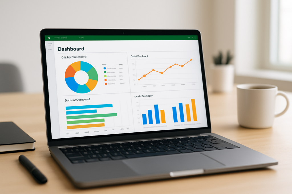
Excel dashboards are powerful tools that help visualize data, monitor key metrics, and make informed decisions. Whether you’re a beginner or an experienced Excel user, starting with well-designed Excel dashboard templates can save time and improve your productivity. In this article, we’ll explore the top free Excel dashboard templates available, walk you through practical examples, and provide actionable steps to customize them for your needs.
Why Use Excel Dashboard Templates?
Excel dashboard templates provide a ready-made framework for organizing and presenting your data. They offer several benefits:
- Time-saving: Skip building dashboards from scratch and use pre-built designs.
- Consistency: Maintain a uniform look and feel across reports.
- Best practices: Learn from professionally designed layouts and formulas.
- Customization: Easily adapt templates to your specific data and goals.
Top Free Excel Dashboard Templates
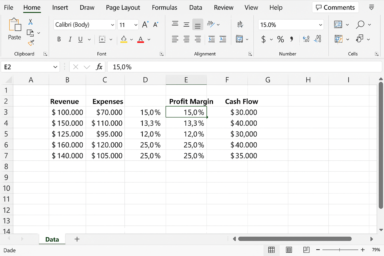
1. Financial Performance Dashboard
This template helps track financial KPIs such as revenue, expenses, profit margins, and cash flow. It includes charts like line graphs, pie charts, and bar charts to visualize trends and distributions.
How to use:
-
- Download the Financial Performance Dashboard template from Microsoft Templates.
- Open the file in Excel.
- Navigate to the Data worksheet and replace the sample financial figures with your own data.
-
- Go to the Dashboard tab to see your updated charts.
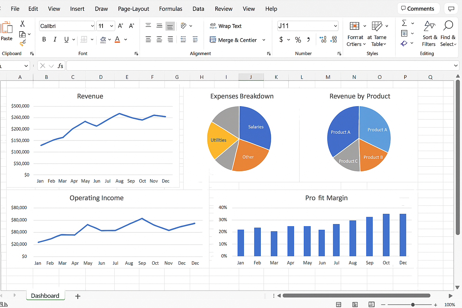
- Use slicers to filter data by months or departments.
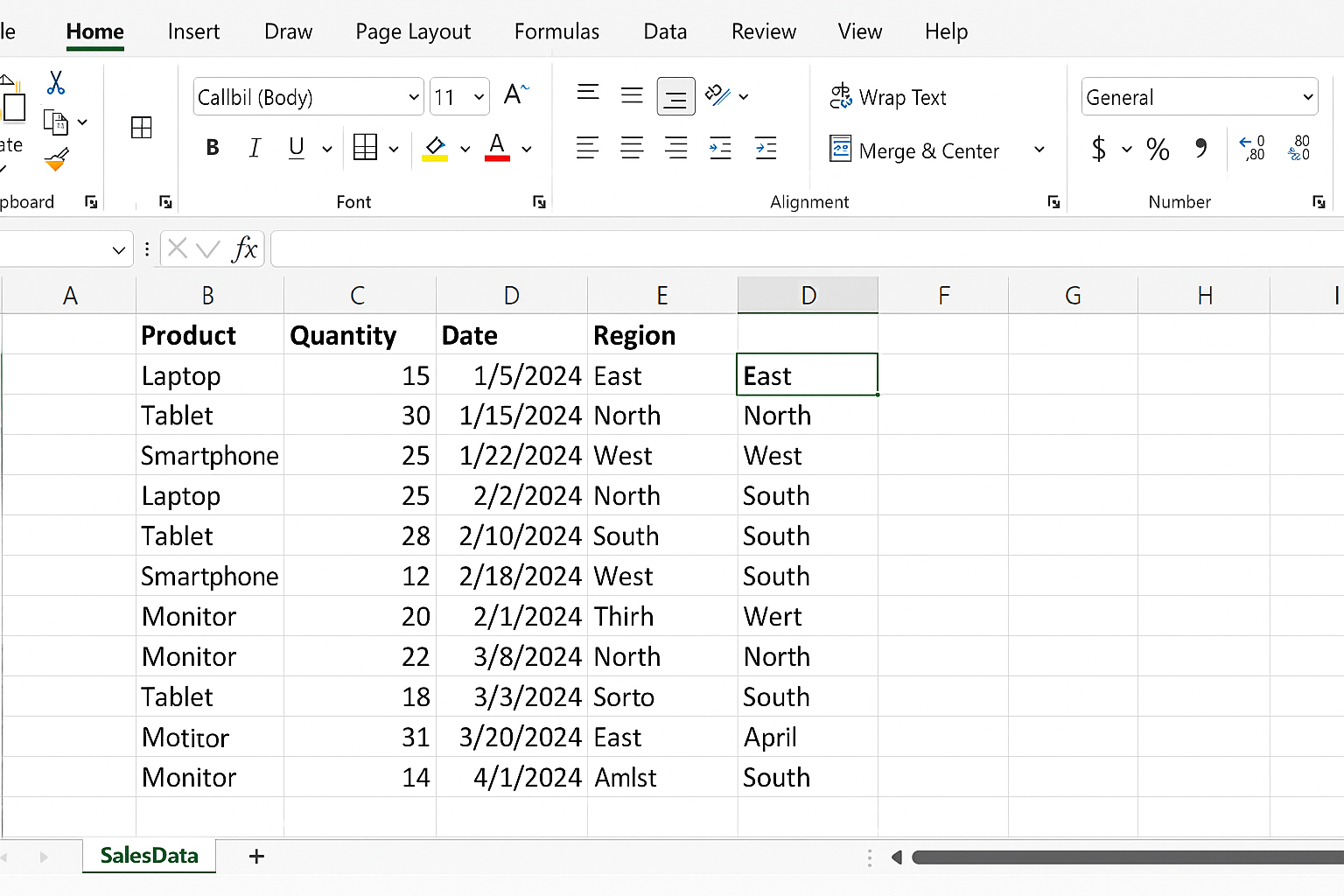
2. Sales Dashboard
Ideal for sales teams, this template tracks sales volume, revenue by product, sales targets, and regional performance.
Hands-on steps:
-
- Download from ExcelTemplates.net.
- Open in Excel and go to the SalesData sheet.
- Input your sales transactions including product names, quantities, dates, and regions.
- Return to the Dashboard sheet to view interactive charts.
- Click on any chart elements to drill down into specific sales segments.
3. Project Management Dashboard
This template offers a visual way to track project progress, task completion, deadlines, and resource allocation.
Usage instructions:
- Find a free Project Management Dashboard template on Vertex42.
- Open the workbook and enter your project tasks, start/end dates, and status into the Tasks sheet.
- Navigate to the Dashboard tab to see Gantt charts and progress indicators.
- Update task statuses regularly to keep the dashboard current.
Practical Example: Customizing a Sales Dashboard Template
Let’s customize the Sales Dashboard template to include a new KPI: Average Order Value (AOV).
-
- Open the Sales Dashboard template.
- Go to the SalesData worksheet.
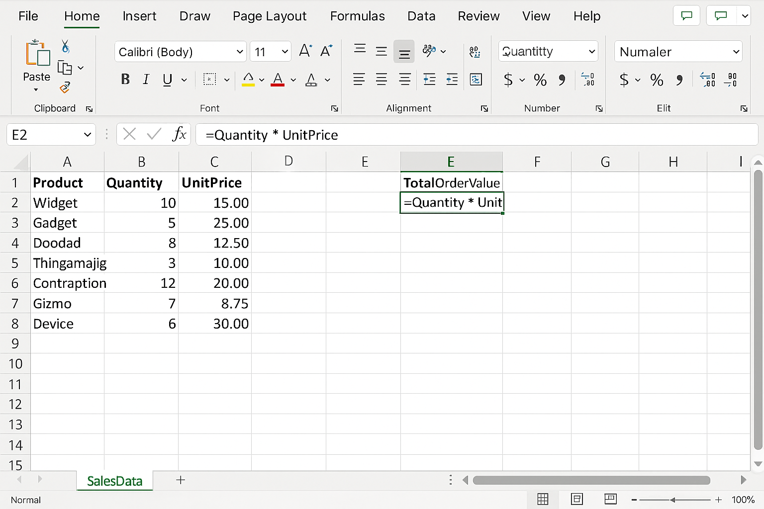
- Insert a new column named TotalOrderValue next to your sales data.
- In the first row of this new column, type the formula:
=Quantity * UnitPriceand press Enter.
-
- Drag the formula down to apply it to all rows.
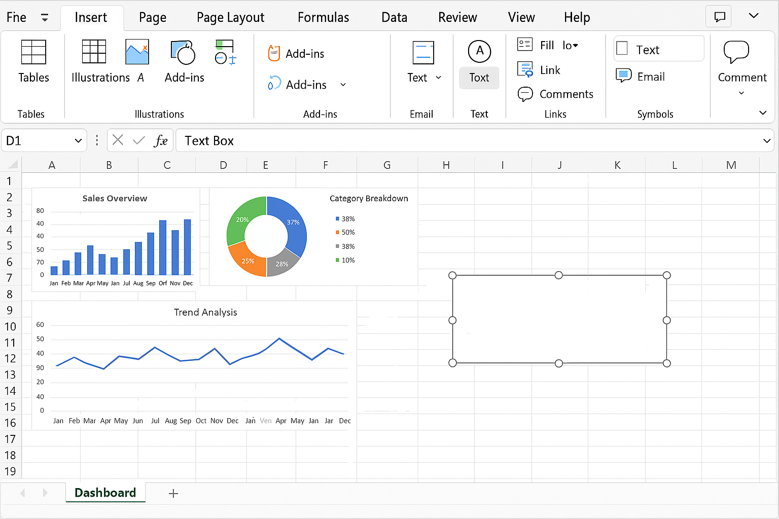
- Return to the Dashboard sheet.
- Insert a new Text Box via Insert > Text Box and position it where you want the AOV displayed.
-
- Click inside the text box and type:
=AVERAGE(SalesData!E2:E100)replacingE2:E100with the correct range of your TotalOrderValue column.
- Click inside the text box and type:
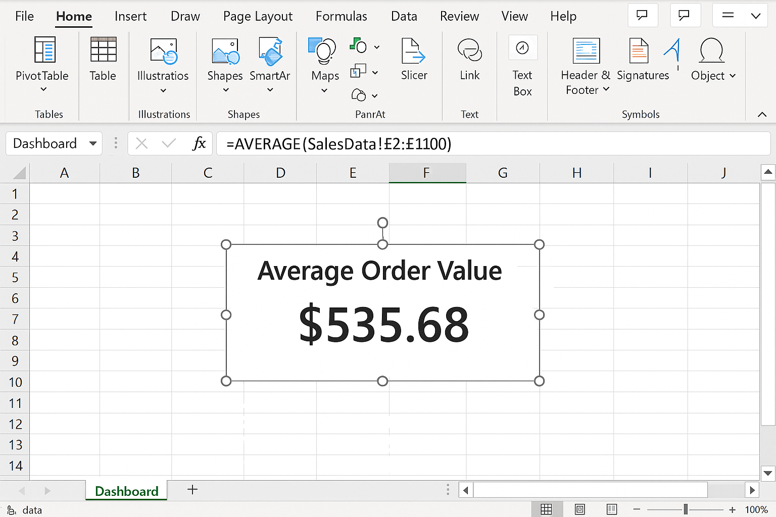
- Press Enter; the box will display the calculated average order value dynamically.
Tips for Working with Excel Dashboard Templates
- Backup original files: Always save a copy before making changes.
- Understand data sources: Know where data comes from and how it updates.
- Use named ranges: Simplify formulas and references.
- Leverage slicers and filters: Enhance interactivity in your dashboards.
- Keep design clean: Avoid clutter; focus on key metrics.
Conclusion
Excel dashboard templates are invaluable resources for anyone looking to visualize and manage data efficiently. By leveraging free, professionally designed templates, you can save time, learn best practices, and create impactful dashboards tailored to your needs. Whether tracking finances, sales, or projects, the templates outlined here provide a strong foundation to get started quickly. Remember to customize them with your own data and KPIs to maximize their usefulness.