How to Build Interactive Economic Dashboards in Excel
Introduction
In the world of economics, data visualization plays a crucial role in interpreting complex datasets and making strategic decisions. Excel remains one of the most accessible and powerful tools for economists to create interactive dashboards that dynamically display economic indicators, forecasts, and trends. This article will guide you through the process of dashboard creation in Excel, tailored specifically for economic data analysis.
Why Use Excel for Economic Dashboard Creation?
Excel offers a combination of flexibility, ease of use, and powerful features such as pivot tables, slicers, and dynamic charts that make it an ideal platform for economists. Unlike specialized software, Excel requires no additional licenses and is widely used in academia and industry, making dashboard sharing and collaboration straightforward.
Step-by-Step Guide to Building Interactive Economic Dashboards in Excel
1. Define Your Economic Metrics
Before jumping into Excel, identify the key economic indicators you want to track. Common metrics include GDP growth rate, inflation rate, unemployment rate, consumer price index (CPI), and trade balance. Clarity on which data points matter most will guide your dashboard design.
2. Collect and Organize Data
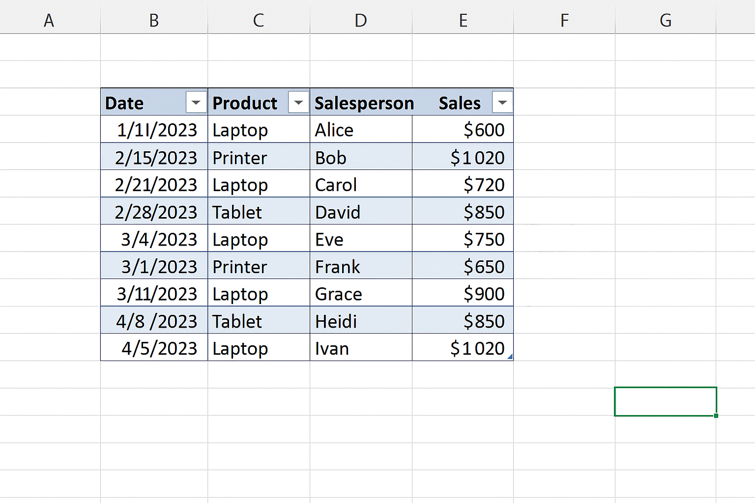
Gather data from reliable sources such as government databases, the World Bank, or the IMF. Import the data into Excel and organize it in a tabular format. Ensure dates are consistent and numeric values are clean and formatted correctly.
3. Use Tables and Named Ranges
Convert your raw data into Excel tables by selecting your dataset and pressing Ctrl + T. Tables make data management easier, especially when updating datasets. Assign named ranges for key data sections to simplify formula references.
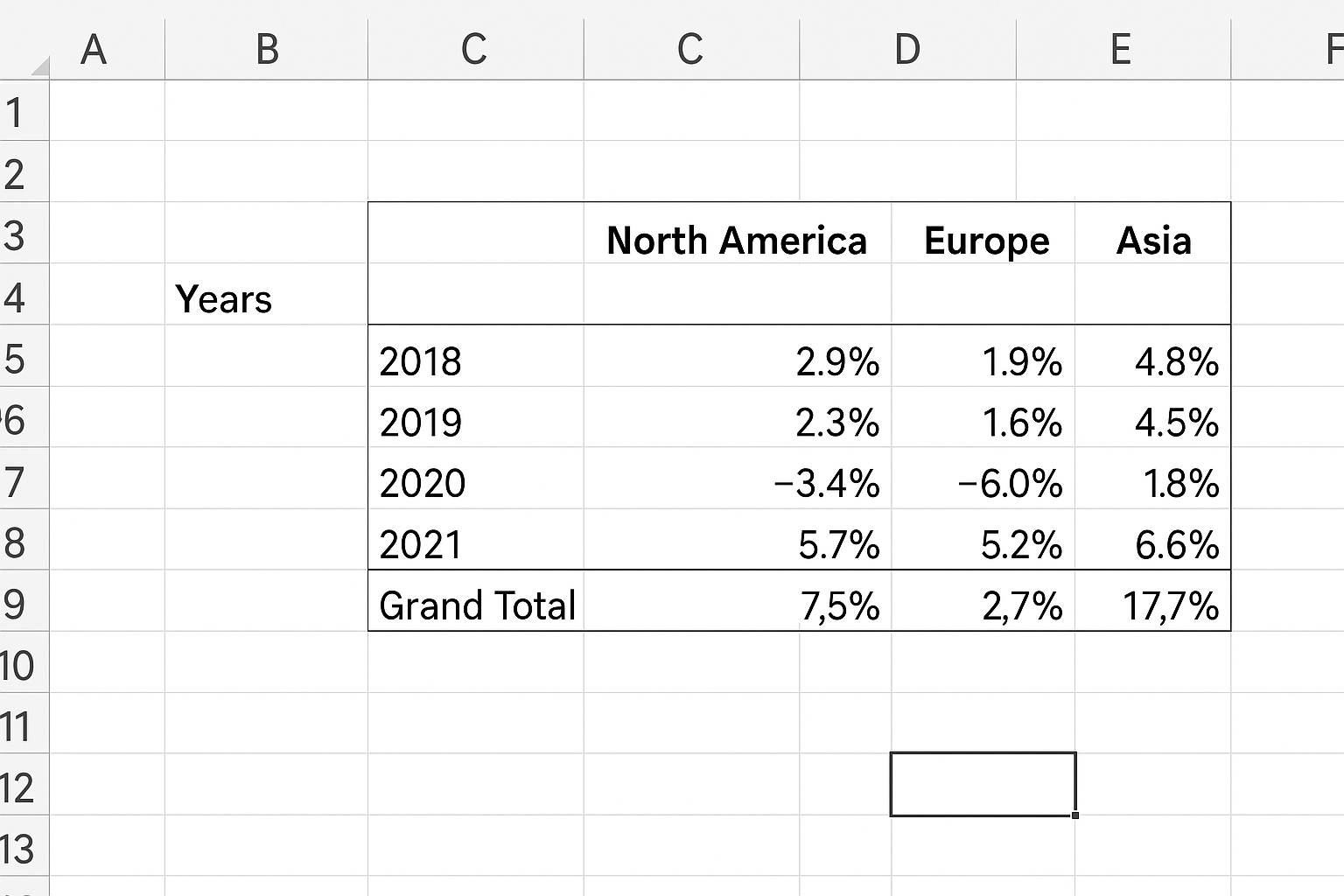
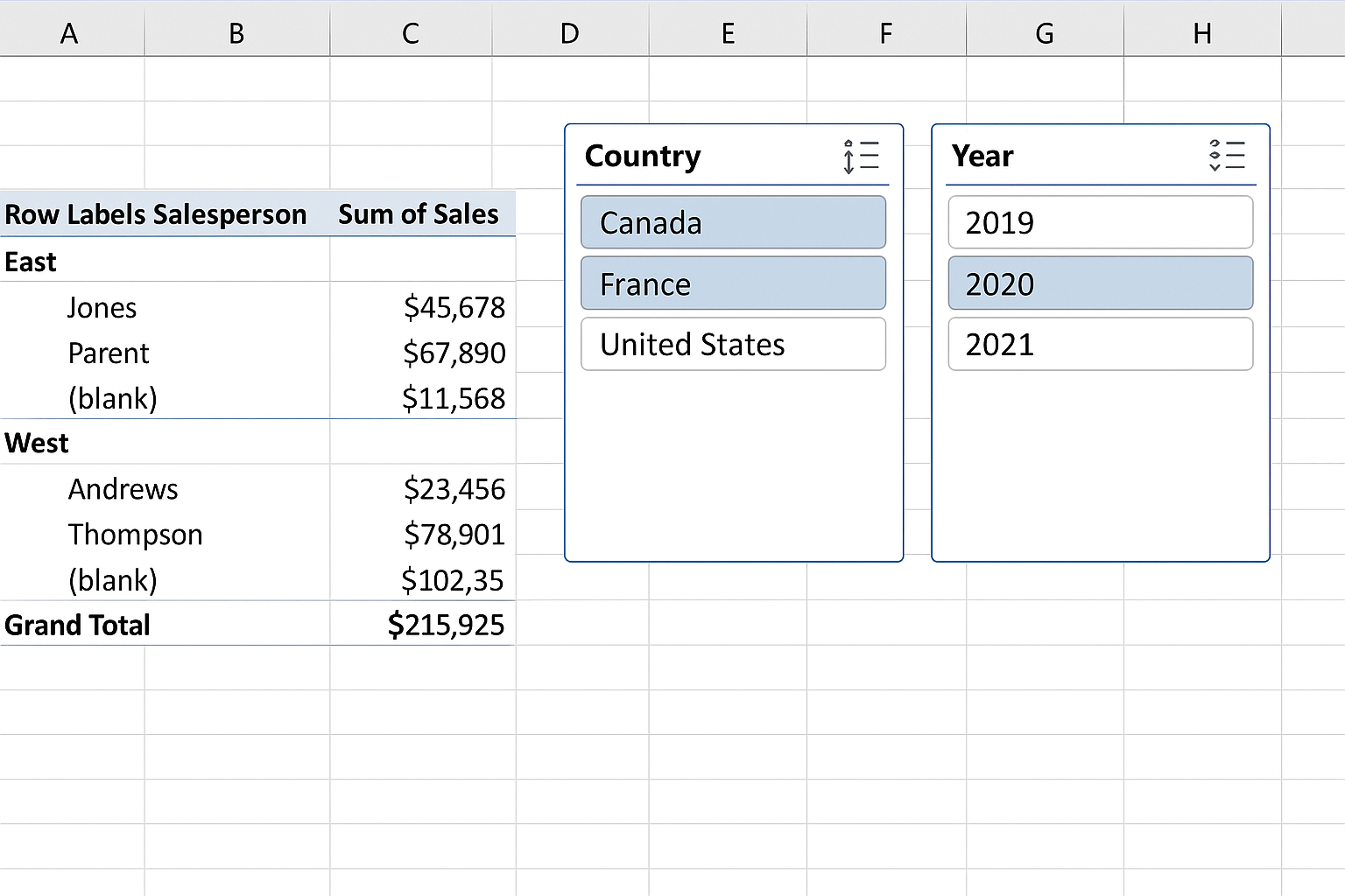
4. Create Pivot Tables for Data Summarization
Pivot tables allow you to summarize large datasets efficiently. For example, create a pivot table to show GDP growth by year and region. This aggregation helps in spotting trends and comparing different economic segments.
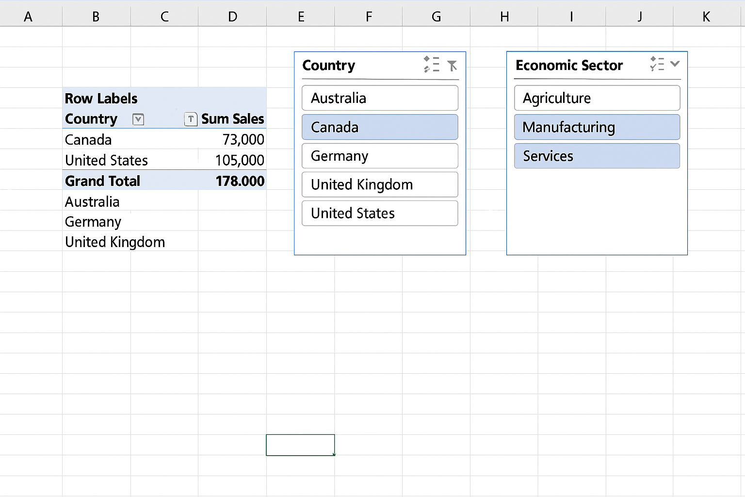
5. Insert Interactive Slicers and Timelines
To add interactivity, insert slicers linked to your pivot tables for categorical filtering (e.g., countries, economic sectors). Use timelines for date filtering, enabling users to view data over specific periods easily.
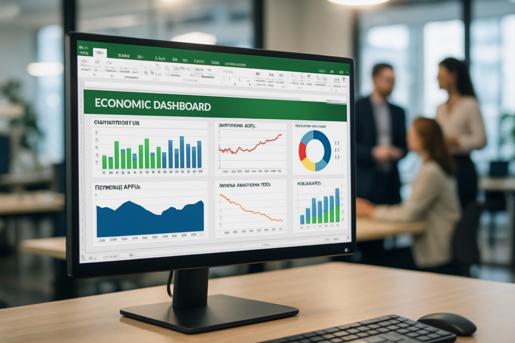
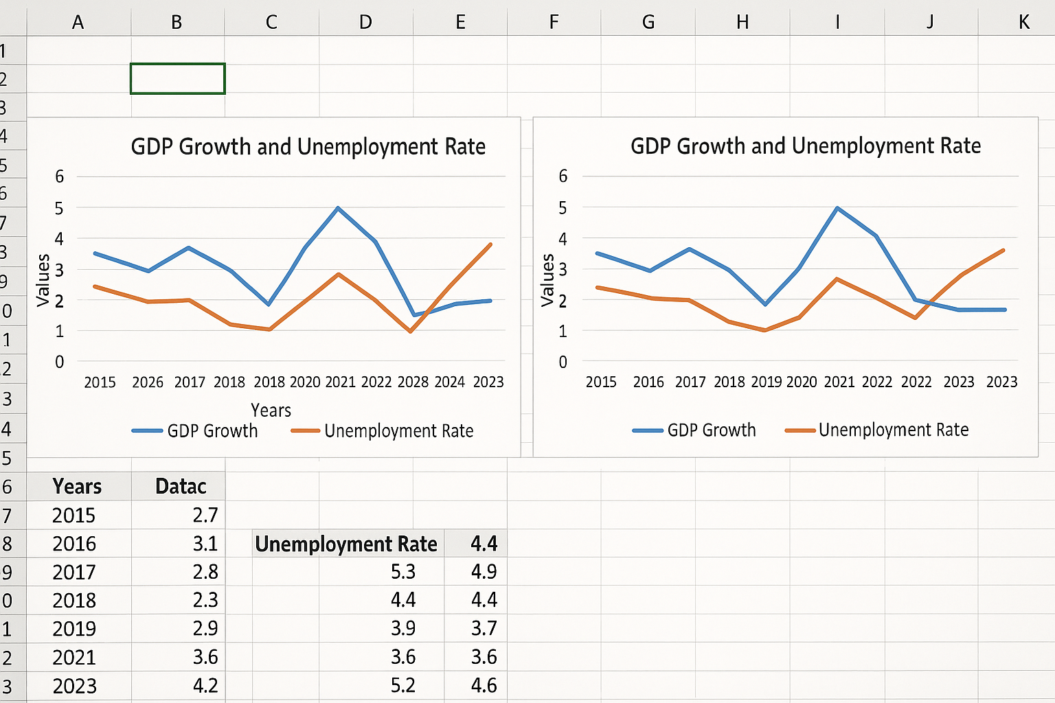
6. Design Dynamic Charts
Visual representation is key in dashboards. Use charts like line graphs for trends, bar charts for comparative metrics, and combo charts for showing multiple series. Link these charts to your pivot tables and slicers so they update dynamically based on user selections.
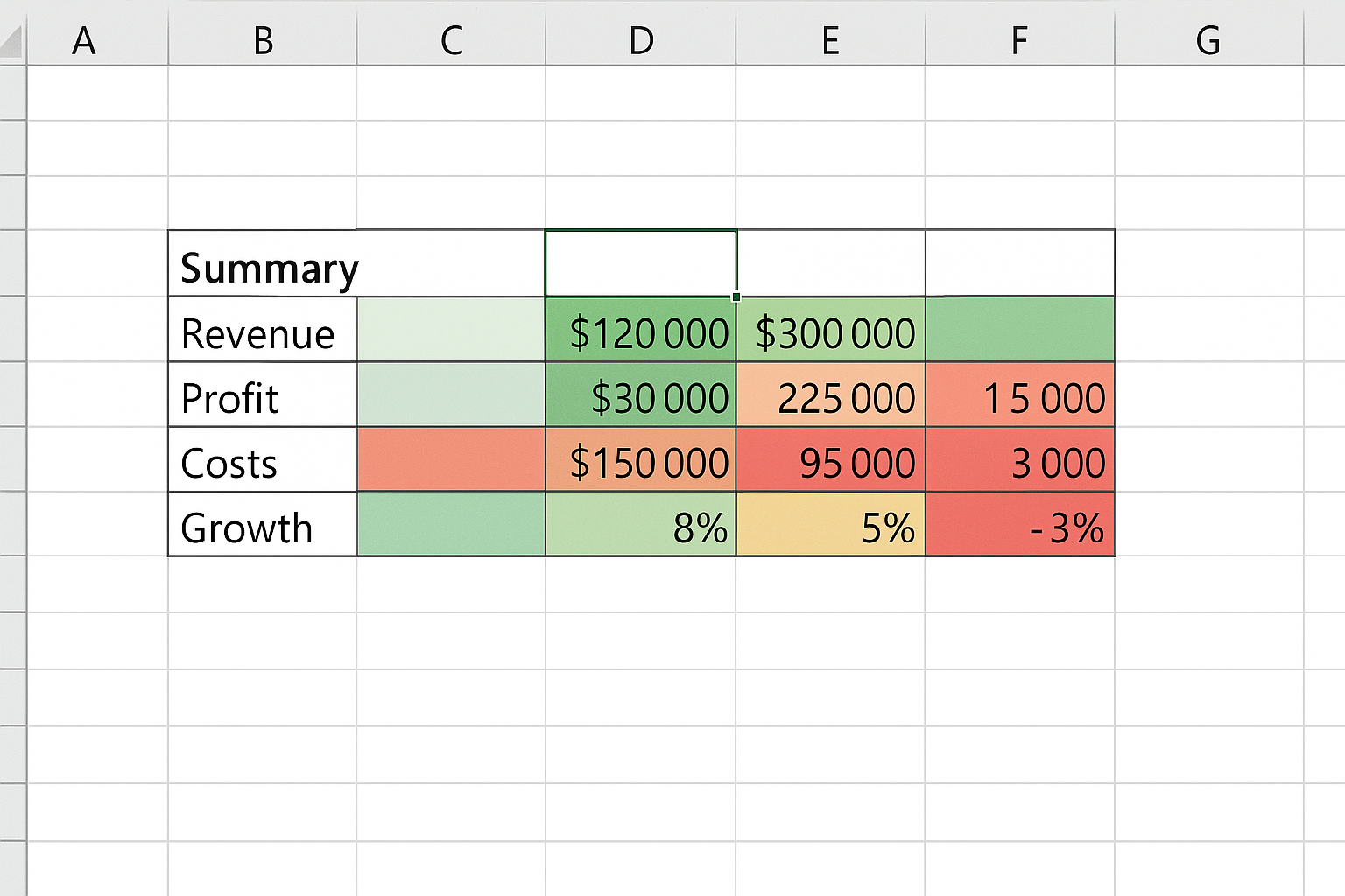
7. Add Key Performance Indicator (KPI) Visuals
Highlight critical metrics using KPI visuals such as data bars, color-coded cells, or sparklines embedded in your dashboard. For instance, use a green-to-red color scale to signify inflation rates within acceptable thresholds.
8. Use Form Controls to Enhance Interaction
Excel offers form controls like dropdowns, checkboxes, and option buttons that can be linked to formulas or VBA scripts for advanced interactivity. For example, a dropdown could allow users to switch between economic scenarios or forecast models.
Practical Example: Building a Simple Economic Dashboard
Let’s create a basic dashboard to track GDP growth and unemployment rates across three countries over five years.
- Data Setup: Organize your data with columns: Year, Country, GDP Growth (%), Unemployment Rate (%).
- Table Creation: Convert this range into a table named EconomicData.
- Pivot Table: Create a pivot table summarizing average GDP growth and unemployment by year and country.
- Slicers: Add slicers for Country and Year.
- Charts: Insert two line charts linked to pivot tables showing GDP Growth and Unemployment Rate trends.
- KPI Indicators: Use conditional formatting on a summary table showing current year metrics.
Best Practices for Dashboard Creation in Excel
- Keep it Simple: Avoid clutter. Focus on key metrics that drive economic insights.
- Consistent Formatting: Use consistent colors, fonts, and chart styles for clarity.
- Test Interactivity: Regularly check that slicers and controls update all linked elements correctly.
- Document Your Dashboard: Include instructions or notes to help users understand how to interact with the dashboard.
Advanced Tips for Economists
For economists comfortable with advanced Excel, consider integrating Power Query for data automation, Power Pivot for complex data models, and DAX formulas for custom calculations. These tools can significantly enhance dashboard functionality and efficiency.
Conclusion
Dashboard creation in Excel is a valuable skill for economists looking to visualize and analyze data in an interactive and insightful way. By following the steps laid out in this article—from data preparation to interactive charting—you can build dynamic dashboards that effectively communicate economic trends. With practice and refinement, Excel dashboards become powerful tools for decision-making and economic forecasting.
Frequently Asked Questions (FAQ)
Related Articles
- Excel Basics Every Economist Should Know
- Top 10 Excel Functions Useful for Economists
- Data Entry Tips in Excel for Economists to Save Time
- How Economists Can Use Excel for Effective Data Analysis
- Using Excel Pivot Tables to Analyze Economic Data
Want practical Excel help?
Support free Excel tutorials, get weekly tips, or contact us for Excel programming, VBA, Power Query, dashboards, and automation work.