Using Conditional Formatting in Excel to Highlight Economic Trends
Introduction
Economists often deal with large volumes of data to analyze economic trends and make informed decisions. Excel, a powerful spreadsheet tool, offers several features to aid in data analysis and visualization. One such feature is conditional formatting, which allows users to apply visual cues such as colors, icons, or data bars to cells based on their values. This article explores how economists can leverage conditional formatting in Excel to highlight economic trends effectively, enabling quicker insights and better presentations.
What is Conditional Formatting?
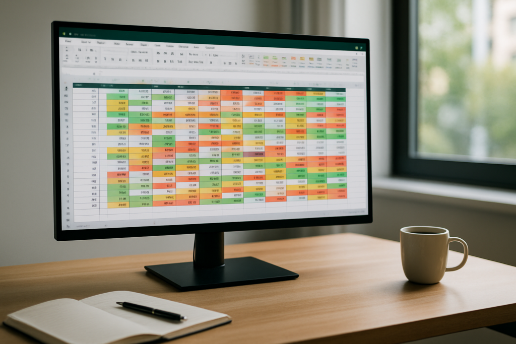
Conditional formatting is a feature in Excel that changes the appearance of cells based on predefined rules. For example, you can highlight cells with values above a certain threshold in green, or use color scales to represent low-to-high data ranges. This visual enhancement helps to quickly identify patterns, outliers, and trends in data sets without manual inspection.
Why Use Conditional Formatting for Economic Data?
Economic data often includes variables such as GDP growth rates, unemployment rates, inflation percentages, and trade balances. These indicators fluctuate over time and vary between countries, regions, or sectors. Conditional formatting helps economists:
- Identify Trends: Easily spot rising or declining trends in indicators.
- Detect Outliers: Quickly recognize unusual data points that may require further analysis.
- Compare Data: Visually compare economic performance across countries, years, or sectors.
- Improve Reports: Make reports and presentations more intuitive and visually appealing.
Types of Conditional Formatting Useful for Economic Data
Excel offers several conditional formatting options that are particularly useful for economists:
- Color Scales: Assign gradient colors to cells based on their values (e.g., red to green).
- Data Bars: Represent numeric values with horizontal bars inside cells.
- Icon Sets: Use icons like arrows or flags to indicate upward, downward, or stable trends.
- Highlight Cell Rules: Format cells based on specific criteria, such as greater than, less than, or between certain values.
Practical Examples of Conditional Formatting for Economic Data
Example 1: Highlight GDP Growth Rates by Country
Suppose you have a table with GDP growth rates for multiple countries over several years. To quickly identify which countries are experiencing strong growth and which are declining, apply a color scale conditional formatting:
- Select the column or range containing GDP growth rates.
- Go to the Home tab, click Conditional Formatting > Color Scales.
- Choose a two-color scale, for example, red (negative growth) to green (positive growth).
This instantly highlights strong performers in green and countries with negative growth in red, making it easier to compare economic health visually.
Example 2: Use Icon Sets to Show Unemployment Rate Trends
If you have monthly or quarterly unemployment rates, you can add icon sets to show whether unemployment is increasing, decreasing, or stable:
- Select the unemployment rate data.
- Click Conditional Formatting > Icon Sets > choose directional arrows.
- Adjust the rule settings so that a green up arrow indicates a decrease in unemployment (positive sign for economists), a red down arrow indicates an increase, and a yellow sideways arrow implies stability.
This helps quickly interpret changes in unemployment trends without analyzing raw numbers.
Example 3: Highlight Inflation Rates Outside Target Range
Central banks often target inflation within a specific range (e.g., 2% ± 1%). To flag inflation rates outside this target:
- Select the inflation rate data.
- Go to Conditional Formatting > Highlight Cell Rules > Less Than, enter 1% and choose a red fill.
- Repeat for Greater Than 3%, also with red fill.
- Leave values within 1% to 3% unformatted or use green fill to highlight acceptable rates.
This visual distinction alerts economists to inflation figures that may require policy attention.
Advanced Tips for Economists Using Conditional Formatting
- Use Formulas for Custom Rules: Apply conditional formatting based on formulas to create complex conditions, such as highlighting countries with GDP growth greater than the average plus one standard deviation.
- Combine Multiple Rules: Layer multiple conditional formatting rules to display nuanced information, like combining data bars with icon sets.
- Dynamic Formatting with Tables: Convert your data range into an Excel Table to automatically extend conditional formatting as you add new data.
- Use Named Ranges: Define named ranges for key data sets to simplify managing conditional formatting rules.
Common Challenges and How to Overcome Them
While conditional formatting is powerful, economists may face some challenges:
- Over-formatting: Avoid using too many colors or icons, which can confuse rather than clarify.
- Performance Issues: Large data sets with complex formatting may slow down Excel. Use simpler formatting or filter data when possible.
- Maintaining Consistency: Use templates or consistent color schemes to ensure reports look professional and are easy to interpret.
Conclusion
Conditional formatting in Excel is an invaluable tool for economists looking to visualize and interpret economic data quickly and effectively. By applying color scales, icon sets, data bars, and custom rules, users can highlight trends, detect anomalies, and enhance presentations. Whether analyzing GDP growth, unemployment rates, or inflation, mastering conditional formatting helps economists turn raw data into actionable insights with clarity and speed.
Frequently Asked Questions
Below are some common questions about using conditional formatting for economic data in Excel.
Related Articles
- Excel Basics Every Economist Should Know
- Top 10 Excel Functions Useful for Economists
- Data Entry Tips in Excel for Economists to Save Time
- How Economists Can Use Excel for Effective Data Analysis
- Using Excel Pivot Tables to Analyze Economic Data
Want practical Excel help?
Support free Excel tutorials, get weekly tips, or contact us for Excel programming, VBA, Power Query, dashboards, and automation work.