Mastering Excel Pivot Tables for Efficient Data Analysis and Automation
Introduction
Excel Pivot Tables are among the most powerful tools for data analysis, allowing users to quickly summarize, explore, and make sense of large datasets without complex formulas. Whether you are a beginner or an advanced Excel user, mastering Pivot Tables can drastically improve your productivity and empower you to perform insightful data analysis effectively.
This article dives deep into using Excel Pivot Tables, providing hands-on steps, practical examples, and tips for automation to maximize your spreadsheet efficiency.
What is an Excel Pivot Table?
A Pivot Table is a dynamic tool in Excel that enables you to reorganize and summarize selected columns and rows of data to obtain a desired report. It allows for quick aggregation such as sums, averages, counts, and percentages, without altering the original data.
Preparing Your Data for Pivot Tables
Before creating a Pivot Table, ensure your dataset is well-structured:
- Organized in tabular form: Each column should have a clear header, and there should be no blank rows or columns within the data.
- Convert to an Excel Table (optional but recommended): Select any cell in your data range, then press Ctrl + T or click Insert > Table. This makes your data dynamic and easier to manage.
Creating Your First Pivot Table
Follow these steps to create a basic Pivot Table:
-
- Select any cell within your dataset or Excel Table.
-
- Go to the Insert tab on the Ribbon and click PivotTable.
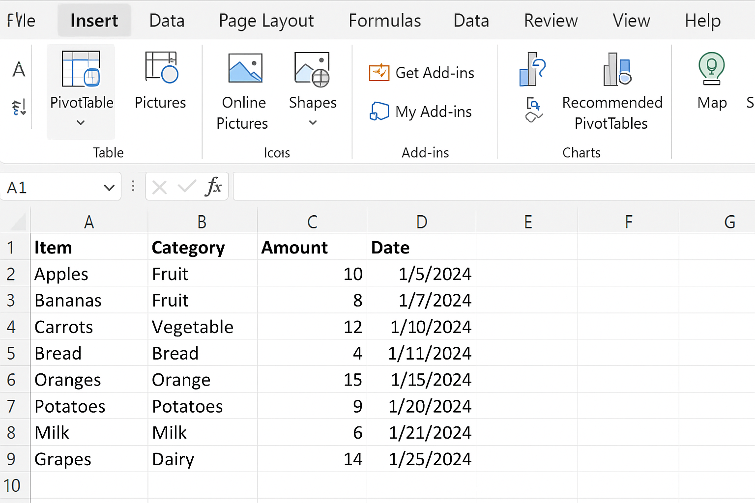
- In the dialog box, verify the data range. Choose whether to place the Pivot Table in a new worksheet or an existing one, then click OK.
Building a Pivot Table Report
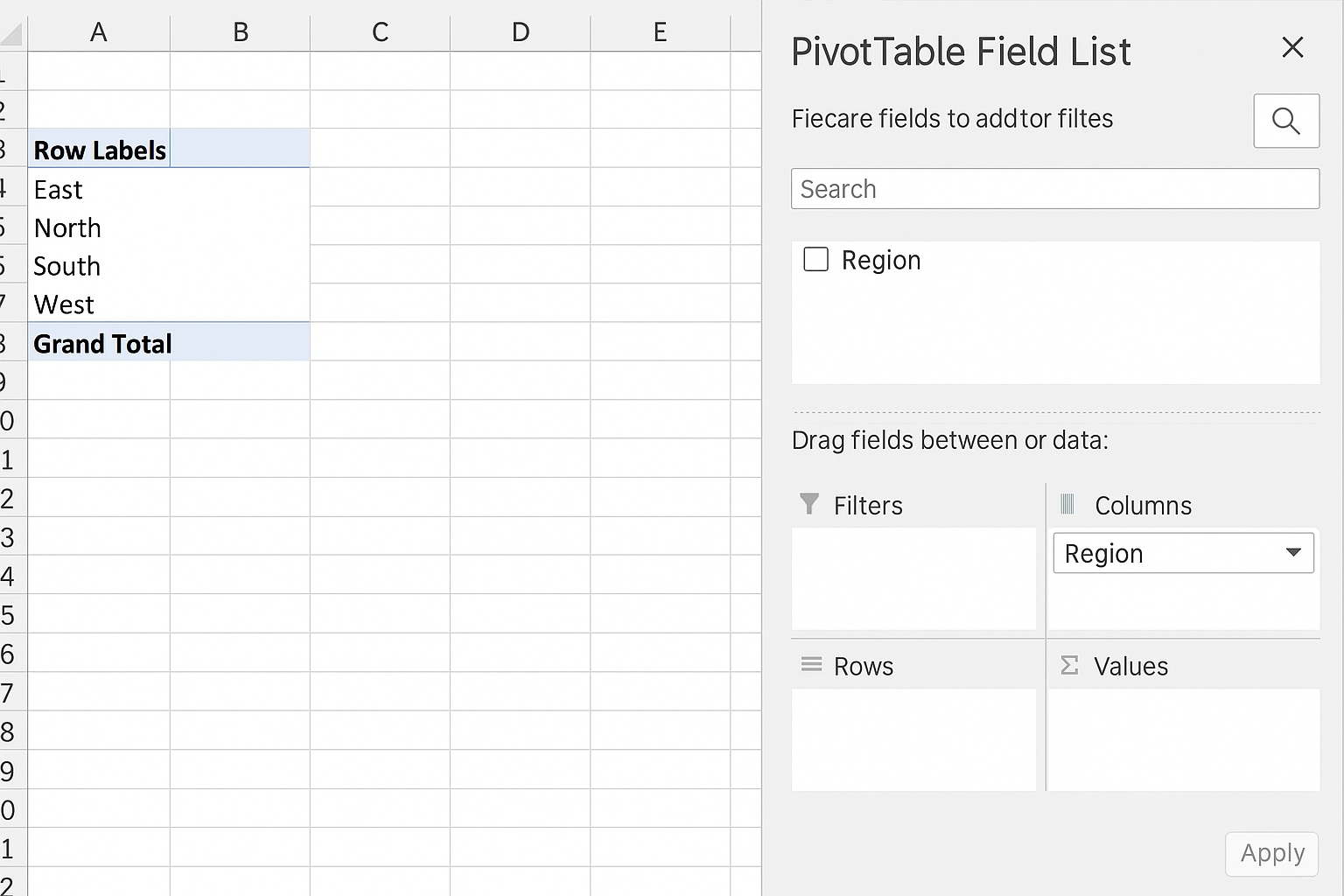
Once the Pivot Table Field List appears, you can drag fields into four areas:
- Rows: Fields here become row labels.
- Columns: Fields here become column labels.
- Values: Numeric data to be aggregated (sum, count, average).
- Filters: Fields used to filter the entire Pivot Table.
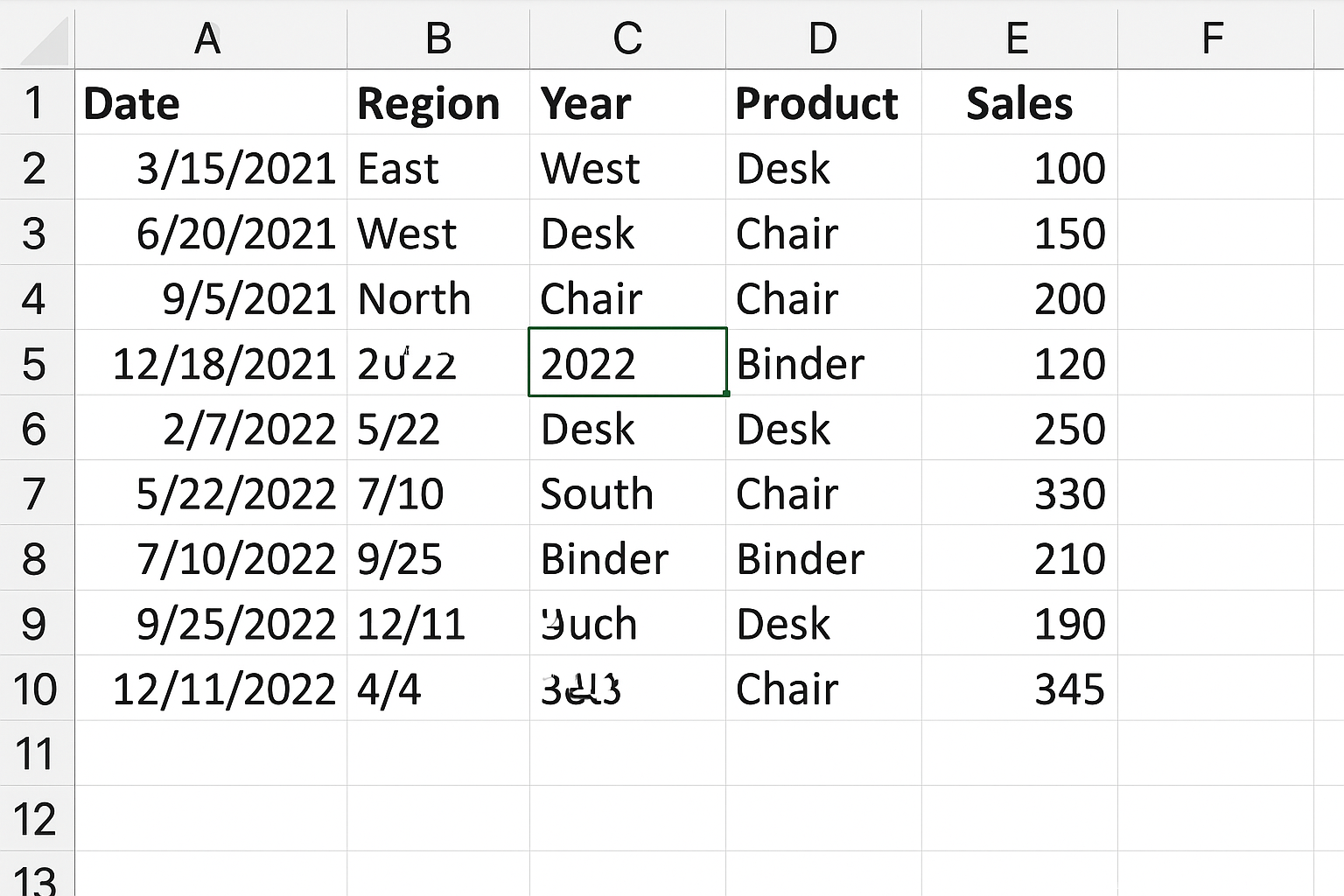
Example: Imagine you have sales data with columns for Order Date, Region, Product, and Sales Amount.
Action Steps:
-
- Drag Region to the Rows area.
-
- Drag Product to the Columns area.
- Drag Sales Amount to the Values area (by default it sums the sales).
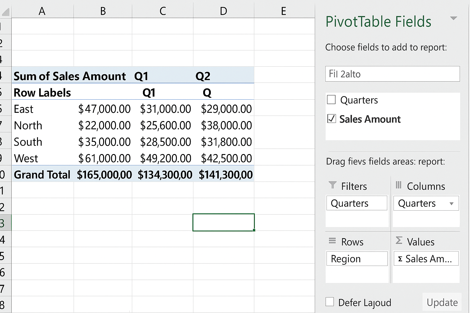
- Drag Order Date to the Filters area to filter sales by date.
This will give you a matrix summarizing total sales for each product by region, with the ability to filter by order date.
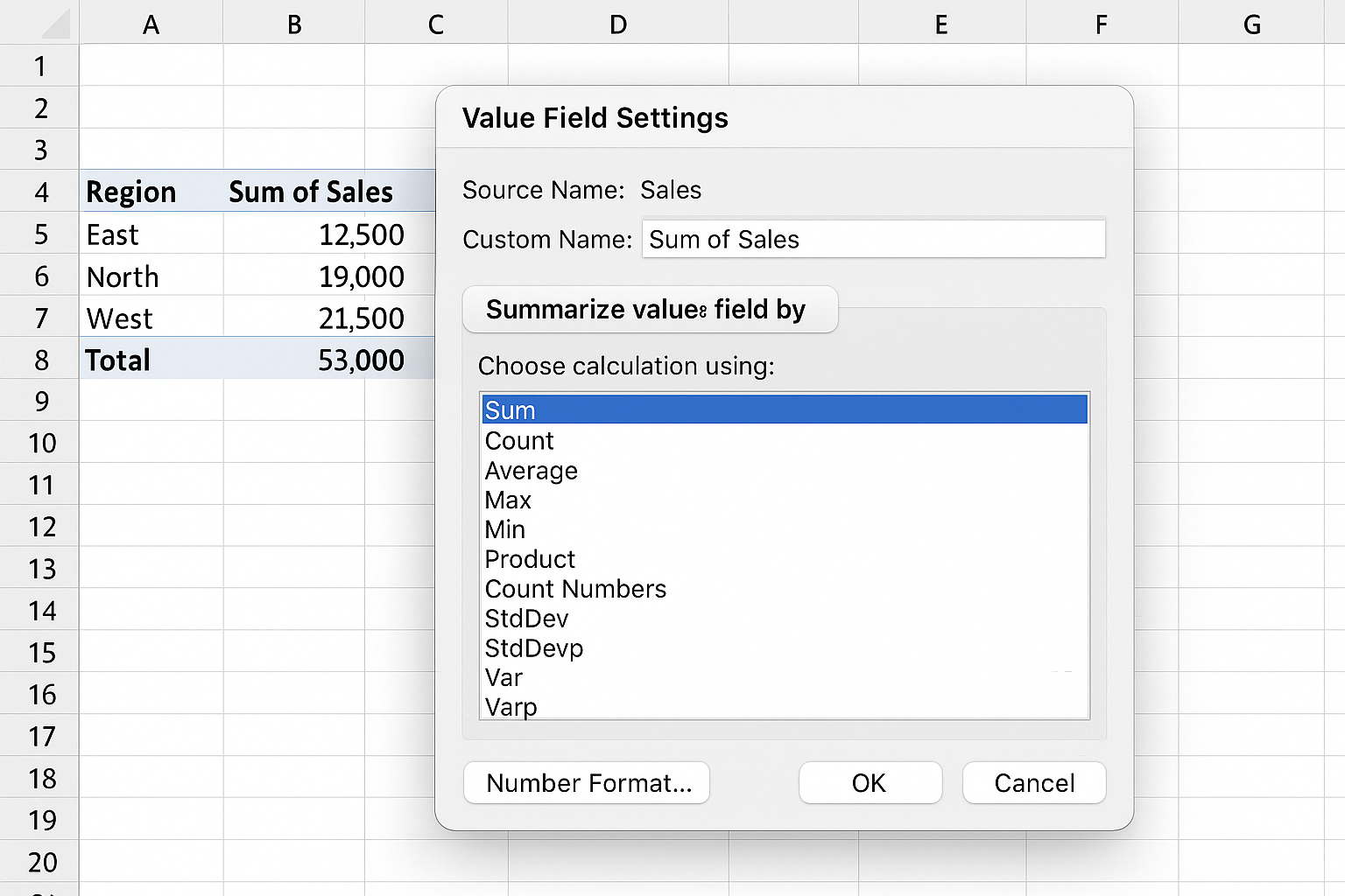
Customizing Value Field Settings
To change how values are summarized:
- Click the dropdown arrow next to the field in the Values area.
- Select Value Field Settings.
- Choose the calculation type (Sum, Count, Average, Max, Min, etc.).
- Click Number Format to format the results (e.g., currency, percentage).
- Click OK.
Grouping Data for Better Insights
You can group data in Pivot Tables for enhanced analysis:
- Group Dates: Right-click a date in the Rows or Columns area and select Group. Choose to group by Months, Quarters, or Years.
- Group Numbers: Select numeric values, right-click, and choose Group to define ranges or bins.
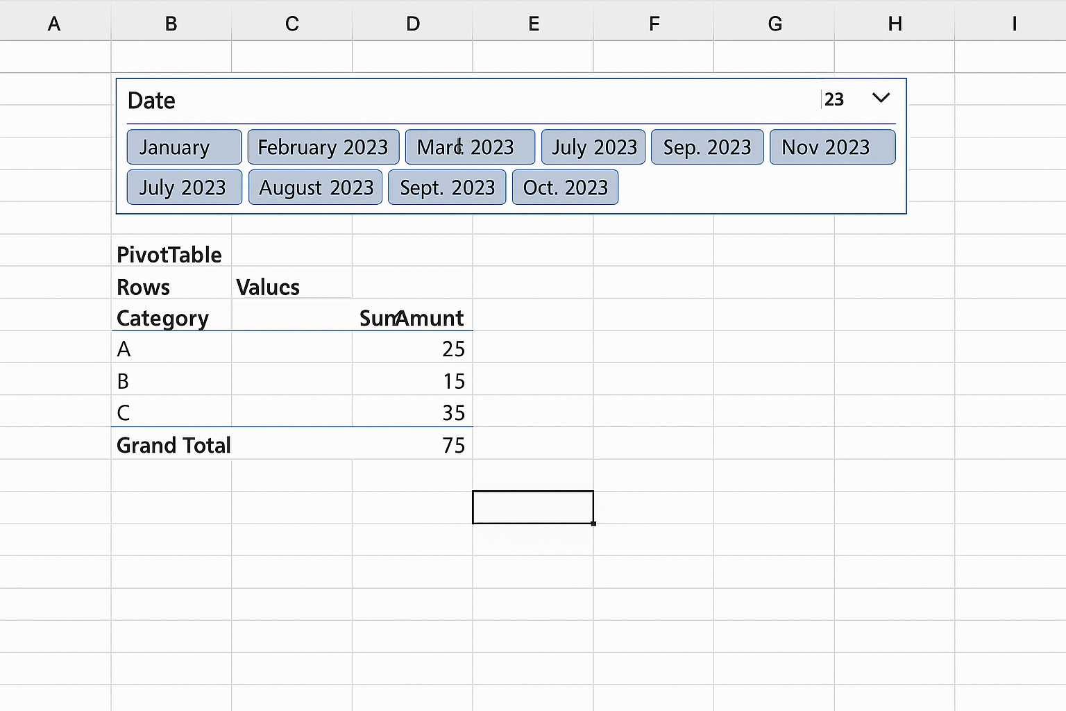
Using Slicers and Timelines for Interactive Filtering
Slicers and Timelines provide user-friendly filter interfaces:
- Insert a Slicer: Click inside the Pivot Table, then go to PivotTable Analyze > Insert Slicer. Select fields for slicers, such as Region or Product.
- Insert a Timeline: Useful for date filtering. Go to PivotTable Analyze > Insert Timeline and select the date field.
Clicking slicer buttons or timeline intervals instantly filters the Pivot Table.
Refreshing Pivot Table Data
Pivot Tables do not update automatically when underlying data changes. To refresh:
- Click anywhere inside the Pivot Table.
- Go to PivotTable Analyze tab and click Refresh.
- Alternatively, press Alt + F5 to refresh the selected Pivot Table.
Automating Pivot Table Updates with VBA
You can automate refreshing Pivot Tables using VBA macros to save time:
Sub RefreshAllPivotTables()
  Dim ws As Worksheet
  Dim pt As PivotTable
  For Each ws In ThisWorkbook.Worksheets
    For Each pt In ws.PivotTables
      pt.RefreshTable
    Next pt
  Next ws
End Sub
This macro loops through all worksheets and refreshes every Pivot Table in the workbook.
Practical Example: Monthly Sales Performance Dashboard
Imagine you want to create a dashboard to track monthly sales performance by product category.
Action Steps:
-
- Organize sales data in an Excel Table with columns: Date, Product Category, Sales Amount.
- Insert a Pivot Table from this table.
- Drag Product Category to Rows.
- Drag Date to Columns and group by Months.
- Drag Sales Amount to Values, ensuring it is summarized by Sum.
- Insert a Timeline for the Date field for interactive month selection.
- Format the Pivot Table with banded rows and currency formatting for clarity.
This dashboard will allow you to slice sales by month and see category-wise performance instantly.
Tips for Enhancing Productivity with Pivot Tables
- Name your Pivot Tables: This makes referencing easier in formulas.
- Use GETPIVOTDATA formulas: Extract specific data points from a Pivot Table dynamically.
- Save your workbook as .xlsm: If using VBA to automate refreshing.
- Combine Pivot Tables with Power Query: For advanced data transformation before analysis.
Conclusion
Excel Pivot Tables are indispensable for anyone looking to analyze data efficiently and automate reporting tasks. By mastering the creation, customization, and automation of Pivot Tables, you can transform raw data into actionable insights with minimal effort. Whether it’s summarizing sales, grouping data, or building interactive dashboards, Pivot Tables provide a robust foundation for data-driven decision making.
Start practicing with your own datasets today, and leverage the power of Pivot Tables to boost your Excel productivity and analytical capabilities.
Want practical Excel help?
Support free Excel tutorials, get weekly tips, or contact us for Excel programming, VBA, Power Query, dashboards, and automation work.