What Is a Pivot Table and How Can It Help You Analyze Data?

Introduction
If you have ever worked with large datasets in Excel, you might have heard the term “pivot table” but wondered exactly what it means and how it can help you analyze data more efficiently. Pivot tables are one of the most powerful features in Microsoft Excel, allowing users to quickly summarize, explore, and present data in a meaningful way without complex formulas.
In this article, we will explain what a pivot table is, how it works, and provide practical examples to show you how to harness its capabilities for better data analysis. Whether you’re a beginner or looking to refresh your skills, understanding pivot tables can significantly boost your productivity and insights.
What Is a Pivot Table?
A pivot table is an interactive data summarization tool available in Excel and other spreadsheet software. It allows you to reorganize and group large amounts of data to extract useful information without altering the original dataset. The word “pivot” refers to the ability to rotate the data, switching rows to columns or vice versa, helping you view the information from different perspectives.
With a pivot table, you can perform various calculations such as sums, averages, counts, and percentages, making it easier to detect trends, patterns, and comparisons within your data. Importantly, pivot tables do not require advanced programming knowledge, making them accessible for users at all levels.
Key Components of a Pivot Table
- Rows: These are the categories that appear vertically in the pivot table. For example, product names or dates.
- Columns: These represent categories displayed horizontally, such as regions or months.
- Values: The numerical data that is summarized, such as sales totals or counts.
- Filters: Filters allow you to limit the data displayed, focusing on specific segments.
How Does a Pivot Table Work?
When you create a pivot table, Excel takes your source data and groups it according to the fields you place in rows and columns. Then it applies the calculation you select to the values, such as summing all sales for each product category by region. You can drag and drop fields to change the layout and instantly see different summaries without writing complex formulas.
For example, if you have a sales dataset with columns like Date, Product, Region, and Sales Amount, a pivot table can quickly display total sales by product or by region, or even break down sales by month and region simultaneously.
Creating a Pivot Table: Step-by-Step Example
Let’s walk through a simple example of creating a pivot table in Excel.
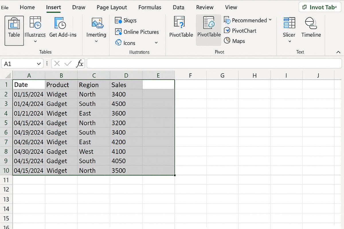
Step 1: Prepare your data. Ensure your dataset has headers and no blank rows or columns. For example:
| Date | Product | Region | Sales |
|---|---|---|---|
| 2024-01-01 | Widget A | North | 500 |
| 2024-01-01 | Widget B | South | 300 |
| 2024-02-01 | Widget A | North | 450 |
| 2024-02-01 | Widget B | South | 350 |
Step 2: Select your data range and go to the Insert tab on the Excel ribbon, then click PivotTable.
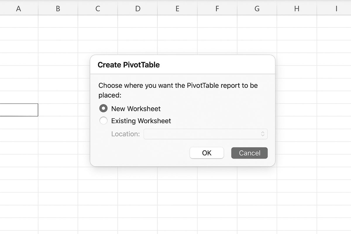
Step 3: Choose where to place the pivot table (new worksheet or existing worksheet) and click OK.
Step 4: In the PivotTable Fields pane, drag Product to the Rows area, Region to the Columns area, and Sales to the Values area.
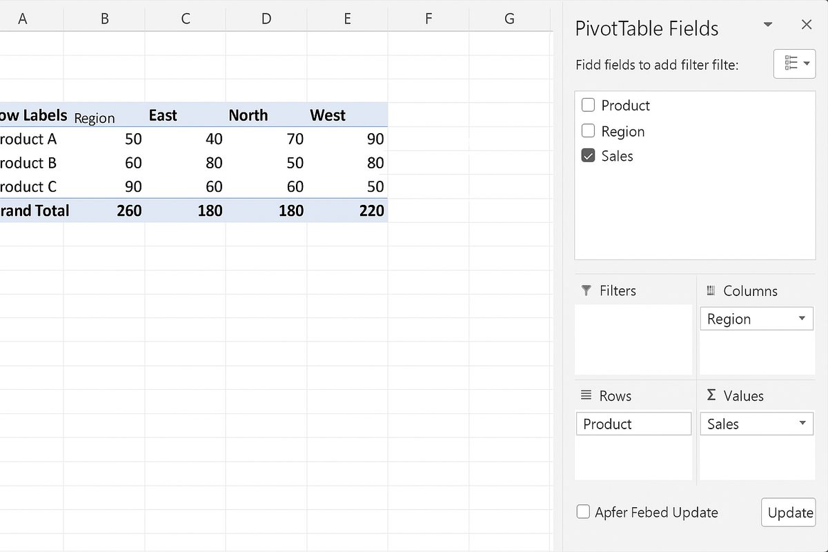
Step 5: Excel will automatically sum the sales and display a table showing total sales by product and region.
Practical Ways Pivot Tables Can Help You Analyze Data
- Summarize Large Datasets: Quickly calculate totals, averages, min/max values without manual calculations.
- Compare Data: Easily compare sales performance across different products, regions, or time periods.
- Identify Trends: Use date fields to aggregate sales by months, quarters, or years to spot seasonal trends.
- Filter and Drill Down: Use report filters to focus on specific data segments, then drill down into detailed records.
- Create Dynamic Reports: Update your data source and refresh the pivot table to get updated summaries instantly.
Advanced Pivot Table Features
Beyond the basics, Excel pivot tables offer features like calculated fields, grouping, and slicers that enhance data analysis:
- Grouping: Group dates into months or quarters, or group numeric data into ranges.
- Calculated Fields: Add new fields based on calculations using existing data.
- Slicers and Timelines: Visual tools to filter pivot tables interactively.
- Conditional Formatting: Highlight important data within the pivot table for better visualization.
Common Mistakes to Avoid When Using Pivot Tables
- Incomplete or Dirty Data: Ensure no blank rows, consistent headers, and clean data to avoid errors.
- Not Refreshing Pivot Table: After updating source data, always refresh the pivot table.
- Overcomplicating Layout: Keep the pivot table layout simple for clarity and readability.
Conclusion
Understanding what a pivot table is and how to use it effectively can transform the way you analyze and interpret data in Excel. Pivot tables provide a flexible and powerful way to summarize large datasets, uncover insights, and create dynamic reports without complex formulas or programming. By practicing with your own data and exploring features like grouping and slicers, you can become proficient in this essential Excel tool and make smarter, data-driven decisions.
Frequently Asked Questions (FAQ)
Related Articles
- Pivot Tables Tutorial: A Beginner’s Guide to Summarizing Data
- How to Create a Pivot Table in Excel Step-by-Step
- Understanding Pivot Table Fields: Rows, Columns, Filters, and Values Explained
- Advanced Pivot Table Techniques to Master Data Analysis
- Using Calculated Fields in Pivot Tables to Perform Custom Calculations
Want practical Excel help?
Support free Excel tutorials, get weekly tips, or contact us for Excel programming, VBA, Power Query, dashboards, and automation work.