Mastering Excel Line Charts with AI-Powered Techniques for Clear Data Visualization

Introduction
Excel line charts are a fundamental tool for visualizing trends and patterns in data. However, when multiple data series overlap, the chart can become cluttered and difficult to interpret. Combining Excel’s powerful features with AI-driven techniques and modern formulas can help create clear, interactive, and insightful line charts that boost productivity and data analysis accuracy.
Step 1: Organizing Your Data Effectively
Start by structuring your data in a clean tabular format. For example, suppose you have monthly sales figures for eight different products over a year. Arrange the months in the first column and each product’s sales in subsequent columns.
Hands-on:
-
- Open your Excel worksheet and input months in
A2:A13(e.g., Jan to Dec).
- Open your Excel worksheet and input months in
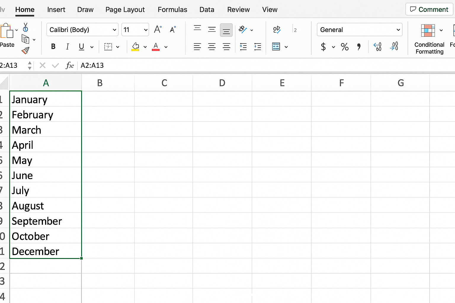
- Enter sales data for each product in columns
BtoI.
Step 2: Creating a Pivot Table for Dynamic Data Analysis
Pivot Tables allow you to summarize and analyze large datasets efficiently. They enable filtering and aggregation without changing your original data.
Hands-on:
-
- Select your entire data range including headers.
- Go to Insert > PivotTable.
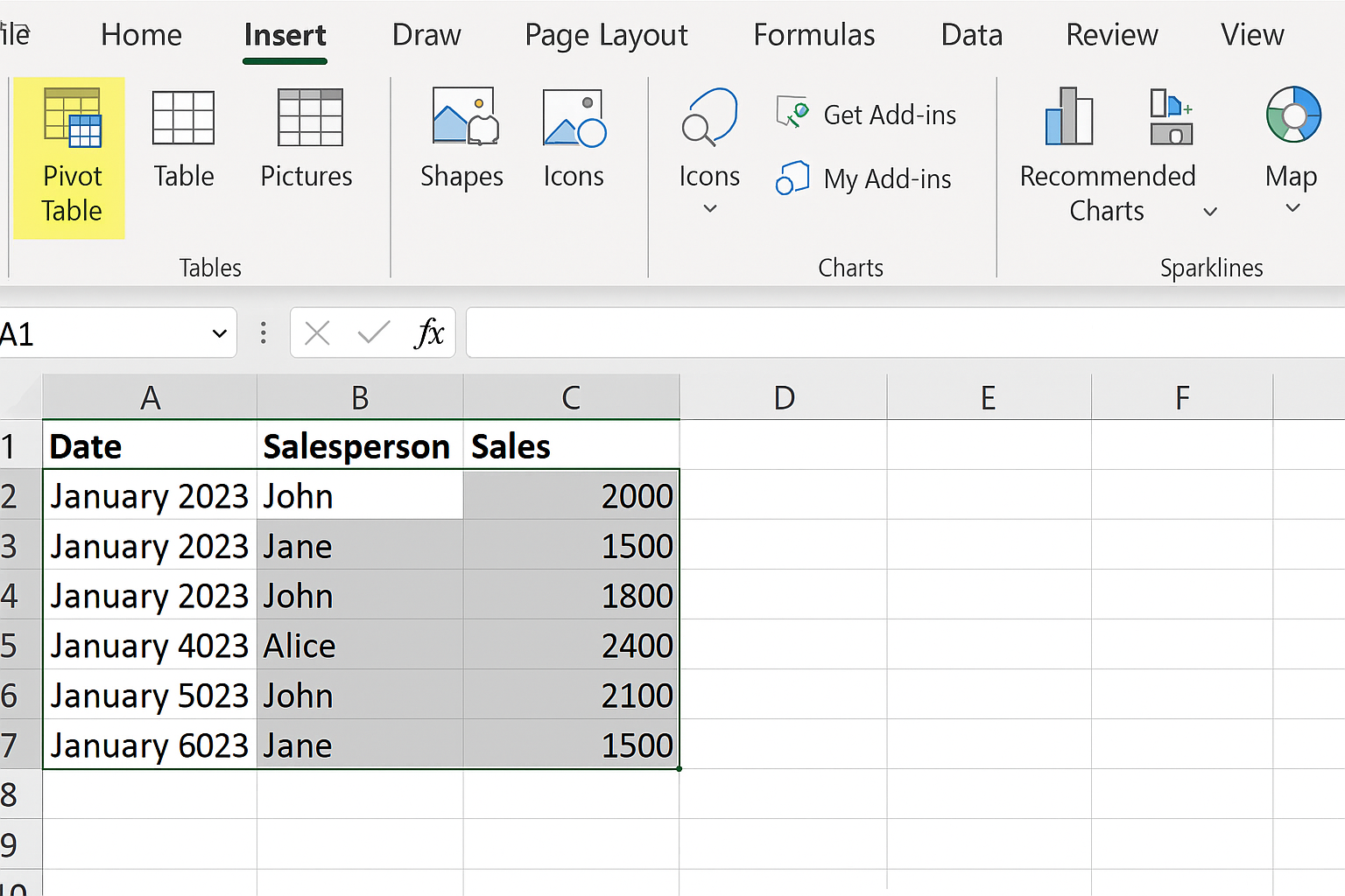
-
- Choose to place the Pivot Table in a new worksheet.
- In the Pivot Table Fields pane, drag ‘Month’ to the Rows area.
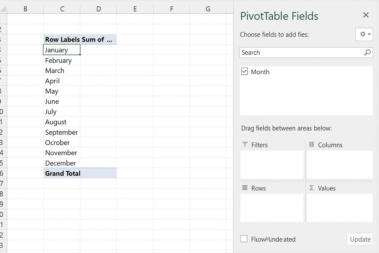
- Drag ‘Product’ to the Columns area.
- Drag ‘Sales’ to the Values area.
Step 3: Using Slicers for Interactive Filtering
Slicers provide clickable buttons to filter Pivot Table data interactively.
Hands-on:
-
- Click anywhere inside the Pivot Table.
- Go to PivotTable Analyze > Insert Slicer.
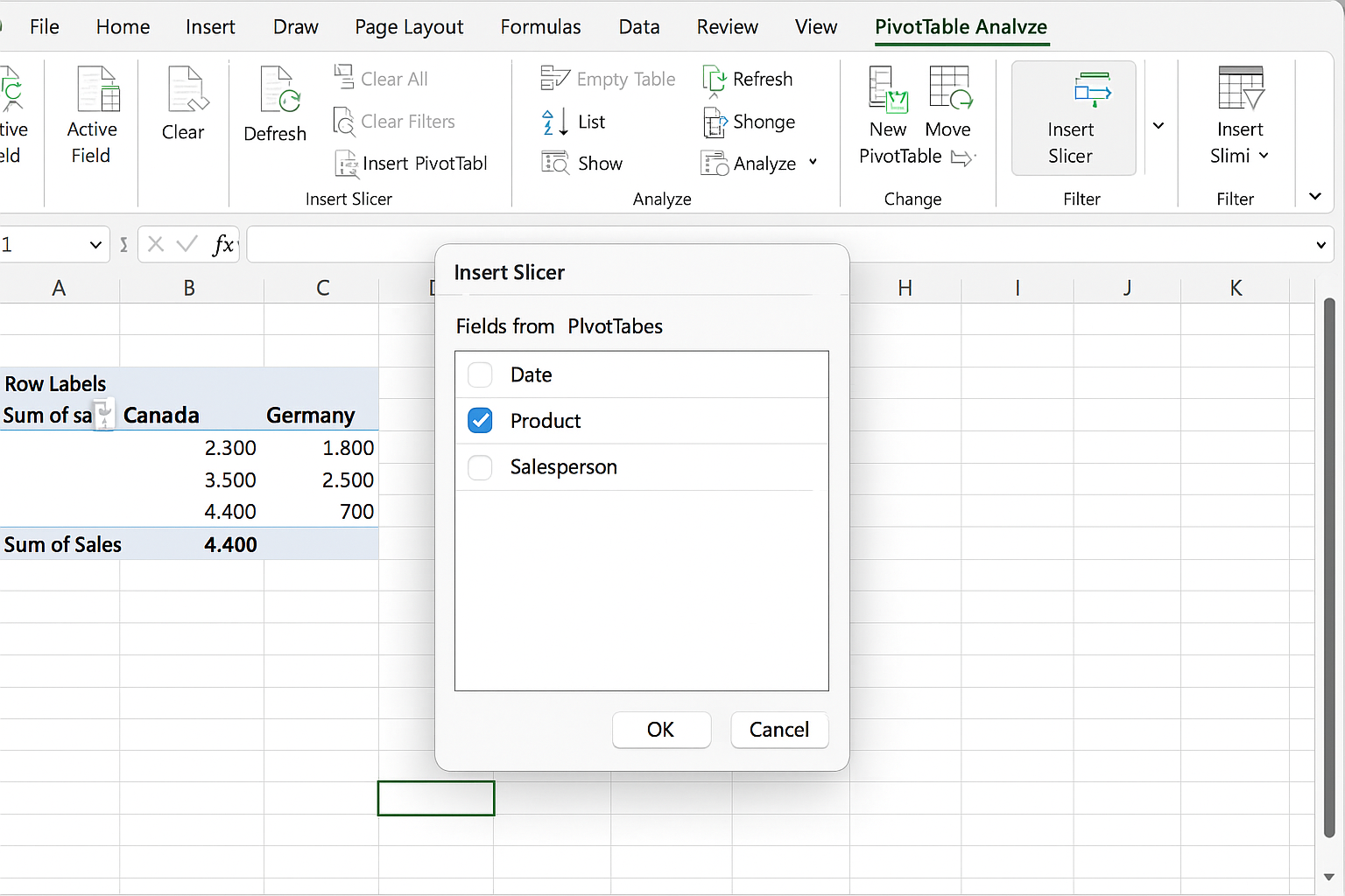
- Select the ‘Product’ field and click OK.
- Use the slicer buttons to toggle visibility of product lines in your chart.
Step 4: Applying Modern Excel Array Functions for Cleaner Data
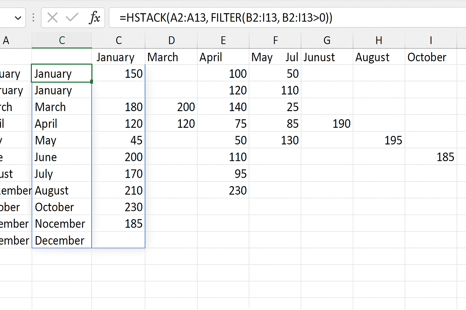
Functions like DROP, HSTACK, and FILTER can manipulate and clean data dynamically, reducing visual clutter in charts.
Example: To exclude zero or empty values from your sales data before charting, use =FILTER(range, range>0).
Hands-on:
-
- In a new sheet, use
=DROP(B2:I13,0,1)to remove the first column (months) if needed. - Use
=HSTACK(A2:A13, FILTER(B2:I13, B2:I13>0))to horizontally combine months with filtered sales data.
- In a new sheet, use
Step 5: Building the Interactive Line Chart
With your Pivot Table and slicer ready, create a line chart that updates dynamically based on slicer selections and filtered data.
Hands-on:
-
- Select your Pivot Table data.
- Go to Insert > Charts > Line Chart.
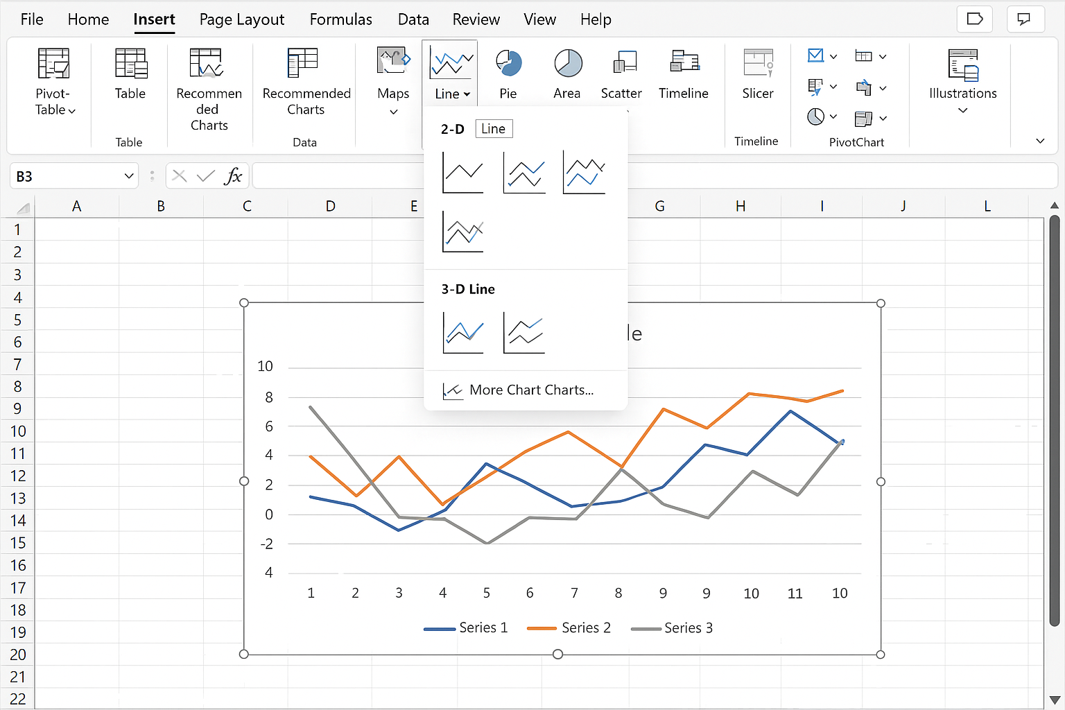
- Format the chart by adding chart titles, legends, and data labels for clarity.
- Click slicer buttons to test the interactivity — the chart updates automatically.
Step 6: Enhancing Productivity with Automation
You can further automate the chart update process using Excel VBA or Power Query to refresh data and formatting based on AI-driven insights or external data sources.
Hands-on Example:
- Record a macro that refreshes your Pivot Table and chart.
- Assign this macro to a button for easy reuse.
Practical Example: Monthly Sales Dashboard
Imagine a dashboard where a user selects different product categories via slicers, and the line chart instantly reflects those selections with clean, non-overlapping lines, highlighting trends and seasonality. Using the techniques above, this dashboard can be created with minimal manual effort and maximum clarity.
FAQ
- Q: How do modern Excel functions like DROP and HSTACK improve chart data?
A: They allow dynamic reshaping and filtering of data arrays, ensuring charts only display relevant, clean data without manual adjustments. - Q: Can slicers be used with regular Excel tables?
A: Slicers primarily work with Pivot Tables and Excel Tables, enabling interactive filtering for charts connected to those tables. - Q: How to avoid clutter when plotting many data series on a line chart?
A: Use slicers to filter visible series, apply dynamic formulas to remove empty or irrelevant data, and limit the number of lines shown simultaneously. - Q: Is it possible to automate chart refreshes when new data arrives?
A: Yes, using VBA macros or Power Query automation you can refresh Pivot Tables and charts automatically. - Q: What are the benefits of combining AI techniques with Excel charts?
A: AI can assist in pattern recognition, suggest optimal visualizations, and automate data cleaning, leading to clearer insights and better decision-making.
Conclusion
Transforming a cluttered line chart into a clean, interactive visualization is achievable by leveraging Excel’s Pivot Tables, slicers, and modern array functions. Integrating AI-powered techniques can further enhance data analysis and automation, making your Excel dashboards smarter and more productive. With these practical steps, you can turn any complex dataset into an insightful story, empowering better business decisions.