Mastering Excel Dashboards with AI: Boost Your Data Analysis and Productivity

Introduction
Excel dashboards are powerful tools that help transform raw data into insightful visual stories. However, designing an effective dashboard that highlights key metrics and communicates insights clearly can be challenging—even for experienced users. Today, Artificial Intelligence (AI) offers exciting new ways to simplify and enhance the process of building Excel dashboards, from choosing the right charts to automating data updates.
Understanding the Role of AI in Excel Dashboard Design
AI can assist in multiple aspects of Excel dashboard creation:
- Chart Recommendations: AI analyzes your dataset and suggests the most appropriate chart types to represent your data effectively.
- Layout Optimization: AI can help arrange dashboard components for readability and impact.
- Data Insights: AI-powered tools can identify trends, outliers, or key metrics that you might overlook.
- Automation: Automate data refreshes, calculations, and visual updates to keep your dashboard current.
Step-by-Step Guide: Building an AI-Enhanced Excel Dashboard
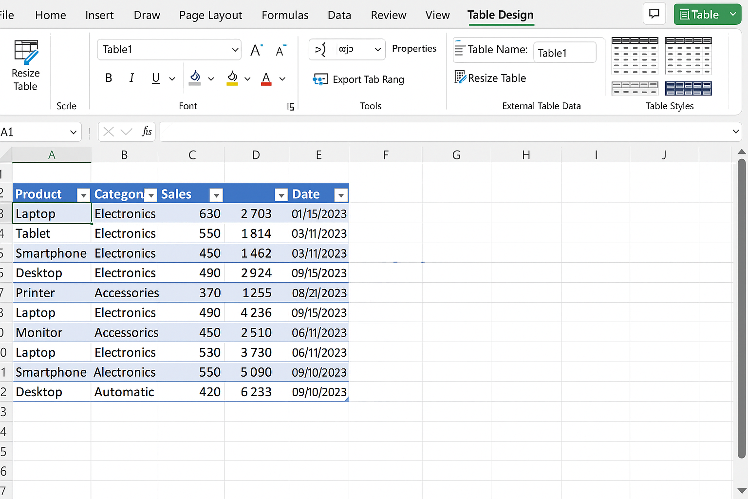
Step 1: Prepare Your Dataset
Start by cleaning and structuring your data. Ensure your data is organized in a tabular format with clear headers.
Action Step: Open Excel and paste your data into a worksheet. Select your data range and press Ctrl + T to create a Table. This makes data management easier.
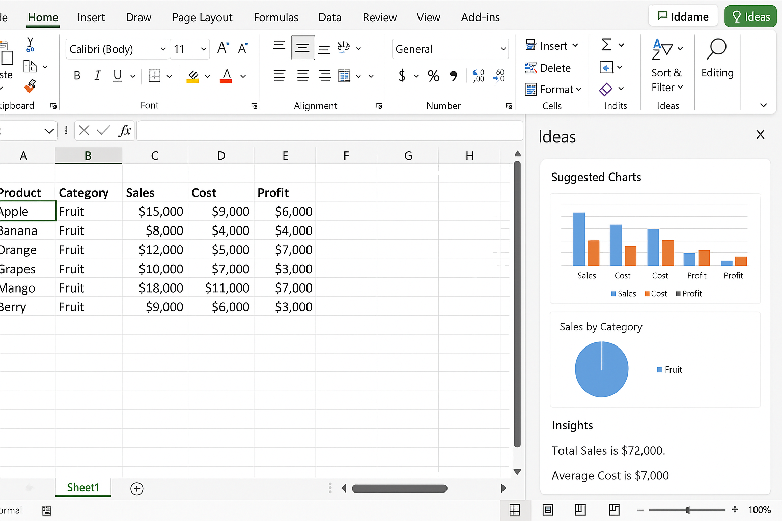
Step 2: Use Excel’s AI-Powered Insights
Excel includes an Ideas feature that leverages AI to analyze your data and generate insights.
Action Step: Select any cell within your table, then go to the Home tab and click on Ideas (lightbulb icon). Review the suggested charts and insights. Choose one that suits your dashboard goals and click Insert.
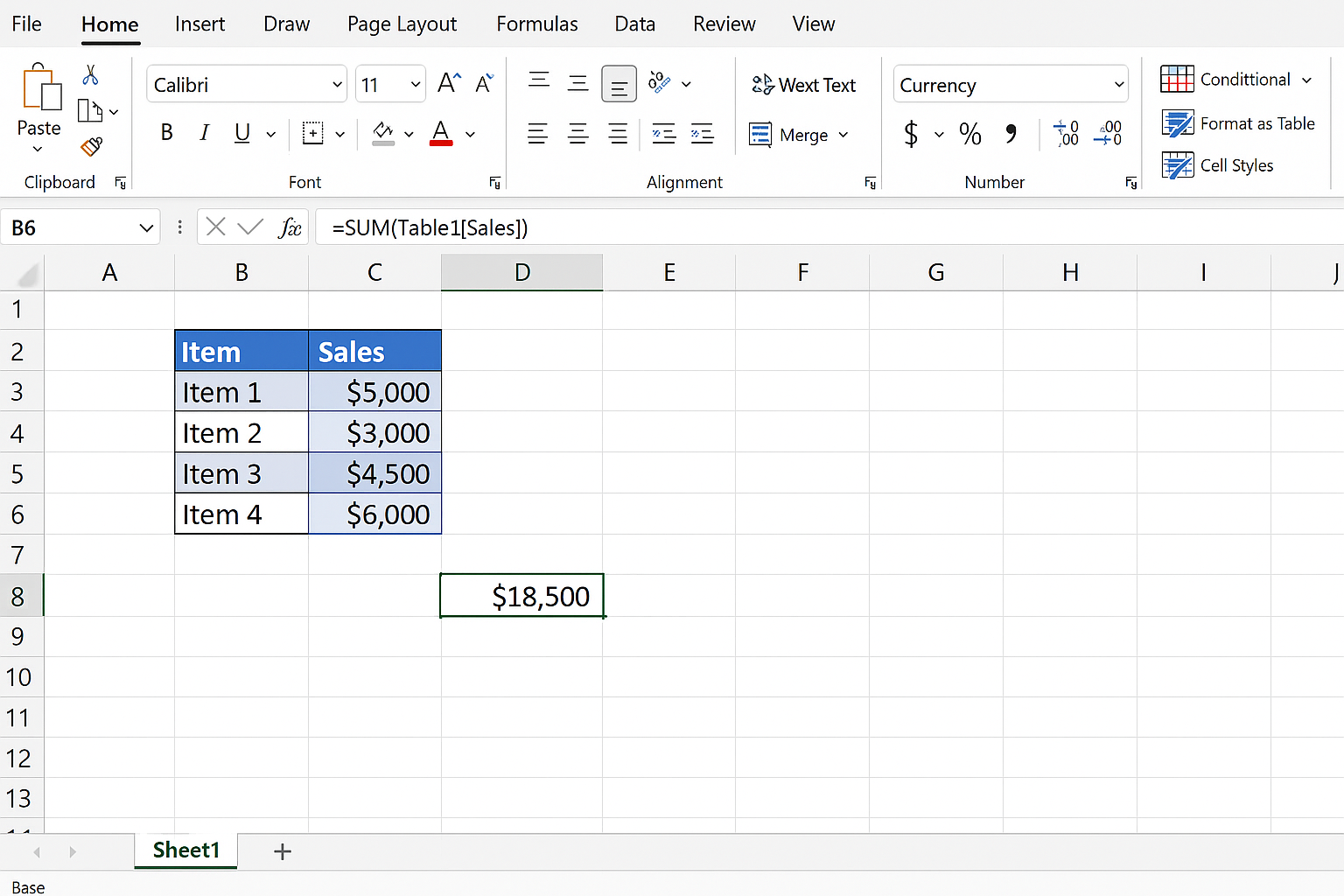
Step 3: Incorporate Formulas for Dynamic Metrics
Use Excel formulas to calculate essential KPIs that update automatically as data changes.
Example: Calculate total sales with =SUM(Table1[Sales]) where Table1 is your table name.
Action Step: In a new cell, type =SUM( and then select the sales column in your table. Close the bracket and press Enter. Format this cell with currency formatting by selecting it, then clicking Home > Number Format > Currency.
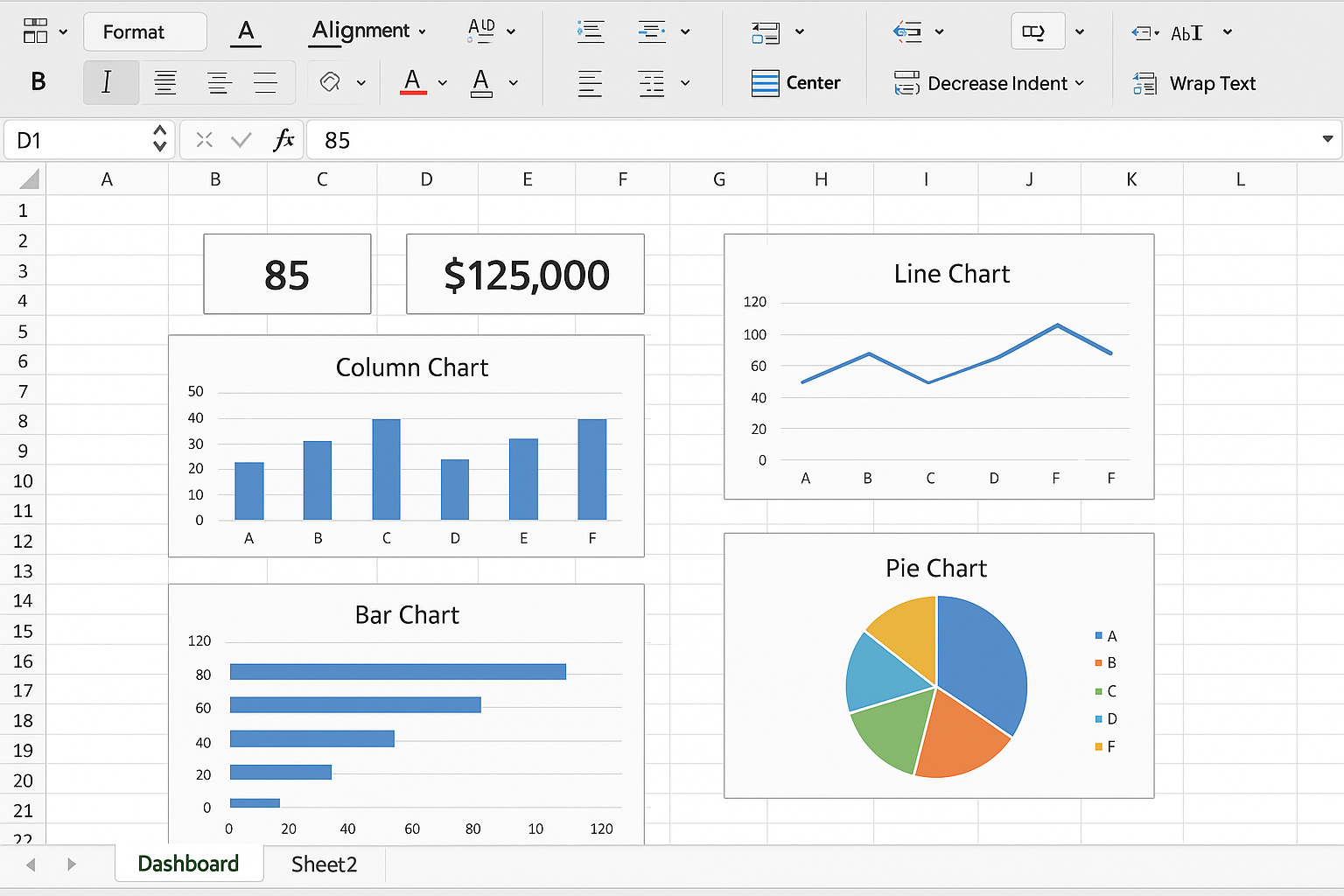
Step 4: Design the Dashboard Layout
Organize your charts, tables, and KPIs clearly on a separate worksheet named Dashboard.
Action Step: Add a new worksheet by clicking the + icon next to existing sheets. Rename it to Dashboard. Copy your charts and key metrics here. Resize and align them by selecting objects while holding Ctrl, then use the Format tab to align and distribute.
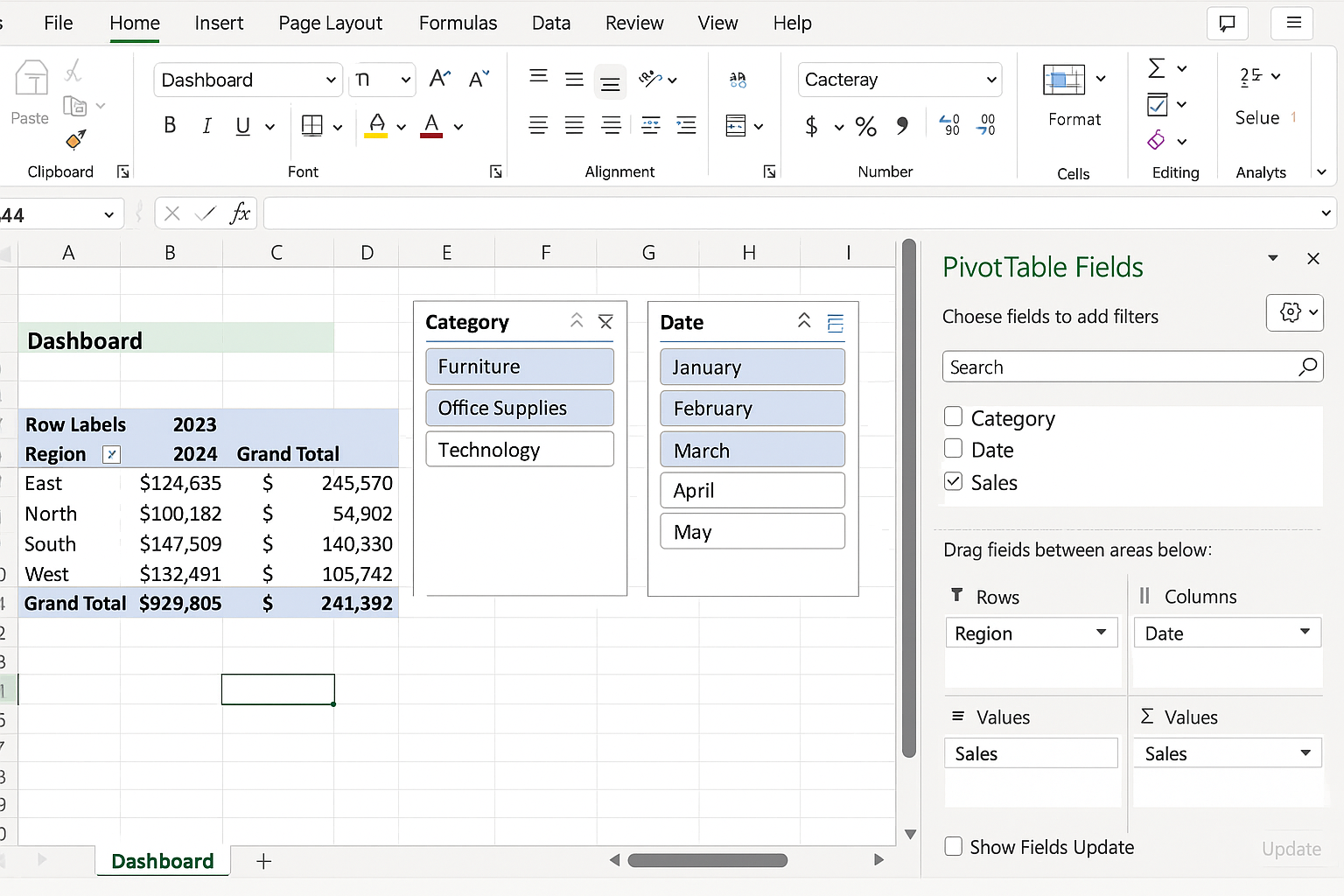
Step 5: Automate Updates with PivotTables and Slicers
PivotTables enable dynamic summarization, and slicers allow interactive filtering.
Action Step: Select your data table, go to Insert > PivotTable, and place it on the Dashboard sheet. Drag fields to Rows, Columns, and Values areas to summarize data. Then, click Insert > Slicer to add filters for categories or dates. Connect slicers to multiple PivotTables by using Slicer Connections.
Step 6: Leverage AI Chatbots for Formula and Design Help
You can use AI chat tools like ChatGPT to generate complex formulas or suggest ways to improve your dashboard.
Example: Ask an AI to provide a formula for calculating year-over-year growth or to recommend a better visualization for sales trends.
Practical Example: Sales Performance Dashboard
Imagine you have monthly sales data by region and product. Using the steps above, you:
- Create a table of sales data.
- Use Ideas to insert a clustered column chart showing sales by region.
- Calculate total sales and average sales per month with
=SUM(Table1[Sales])and=AVERAGE(Table1[Sales]). - Insert a PivotTable summarizing sales by product category and a slicer for months.
- Arrange charts and KPIs on the Dashboard sheet, aligning them neatly.
Tips for Maximizing AI in Excel
- Keep Data Clean: AI tools perform best on well-structured data.
- Be Specific: When asking AI for help, clearly describe your goal for more accurate suggestions.
- Combine Tools: Use Excel’s built-in AI features alongside external AI assistants for best results.
- Test and Iterate: Adjust charts and formulas based on audience feedback to improve dashboard effectiveness.
Frequently Asked Questions
Can AI create Excel dashboards automatically?
While AI can suggest charts and insights, fully automatic dashboard creation still requires user input for customization and context understanding.
What Excel features use AI?
Features like Ideas, Data Types, and dynamic array functions leverage AI to analyze data and improve productivity.
How do I keep my dashboard up to date?
Use Excel Tables, PivotTables, and formulas linked to your data source. Refreshing your data and pivot caches updates the dashboard automatically.
Can AI help with complex Excel formulas?
Yes, AI chatbots can generate and explain advanced formulas, saving time and reducing errors.
Is AI integration available in all Excel versions?
AI-powered features are mainly available in Microsoft 365 versions of Excel with internet connectivity.
How do I ensure my dashboard is user-friendly?
Use AI to optimize layout and design, keep visuals simple, and test the dashboard with your target audience for clarity.
Conclusion
Integrating AI into Excel dashboard design empowers you to create more insightful, dynamic, and visually appealing reports with less manual effort. By combining Excel’s AI features with smart data preparation, formulas, and automation techniques, you can boost your productivity and deliver dashboards that truly inform decision-making. Start experimenting with AI tools today and transform your Excel workflows into intelligent, efficient processes.