Understanding Pivot Table Fields: Rows, Columns, Filters, and Values Explained
Introduction
Pivot tables are powerful tools in Excel that allow users to summarize, analyze, and visualize complex datasets quickly. However, understanding how pivot table fields work is crucial to harness their full potential. In this article, we will dive deep into pivot table fields explained — specifically, the Rows, Columns, Filters, and Values areas — and how each contributes to creating insightful reports. Practical examples will guide you through setting up pivot tables effectively.
What Are Pivot Table Fields?
When you create a pivot table in Excel, you work with different field areas that help you organize and display your data. These fields are typically categorized into four main areas:
- Rows
- Columns
- Filters
- Values
Each field area plays a distinct role in shaping the pivot table output. Let’s explore each one in detail.
1. Rows Field
The Rows field determines how data is grouped vertically in your pivot table. When you drag a field into the Rows area, Excel lists unique values from that field down the rows of the table. This grouping helps organize your data for easy comparison.
Example: Suppose you have sales data with a “Region” field. Placing “Region” in the Rows area will list each region vertically, allowing you to see sales data organized by region.
Rows fields can be nested, meaning you can add multiple fields to Rows to create hierarchical groupings. For example, adding “Region” and then “Salesperson” will first group by region and then by salesperson within each region.
2. Columns Field
The Columns field works similarly to Rows but organizes data horizontally across the top of the pivot table. When you place a field here, Excel creates unique column headers for each value in the field.
Example: Continuing with the sales data, placing “Quarter” in the Columns area will display sales data horizontally broken down by quarters (Q1, Q2, Q3, Q4).
Using Columns fields alongside Rows allows you to create a matrix-style report that cross-tabulates two dimensions of your data.
3. Filters Field
The Filters field adds interactivity by allowing you to filter the entire pivot table based on selected criteria. Fields placed here create a dropdown filter above the pivot table, enabling you to focus on specific subsets of your data without altering the table structure.
Example: If you add “Product Category” to the Filters area, you can quickly switch the pivot table view to show data only for “Electronics,” “Furniture,” or any other category in your dataset.
Filters are especially useful when you want to present summarized data but need flexibility to analyze individual segments.
4. Values Field
The Values field is where the numerical summaries and calculations happen. When you drag a numeric field here, Excel performs aggregate functions like SUM, COUNT, AVERAGE, etc., based on the data grouped by Rows and Columns.
Example: In sales data, dragging “Sales Amount” into Values will sum total sales per row and column grouping. You can also customize the calculation to show averages, counts, or other summary statistics.
Values fields form the core of pivot table analysis, converting raw data into meaningful metrics.
Practical Example: Creating a Sales Summary Pivot Table
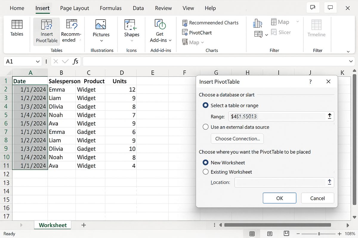
Let’s create a pivot table for a sample dataset containing the following fields: Region, Salesperson, Product Category, Quarter, Sales Amount.
- Insert the Pivot Table: Select your dataset and go to Insert > Pivot Table.
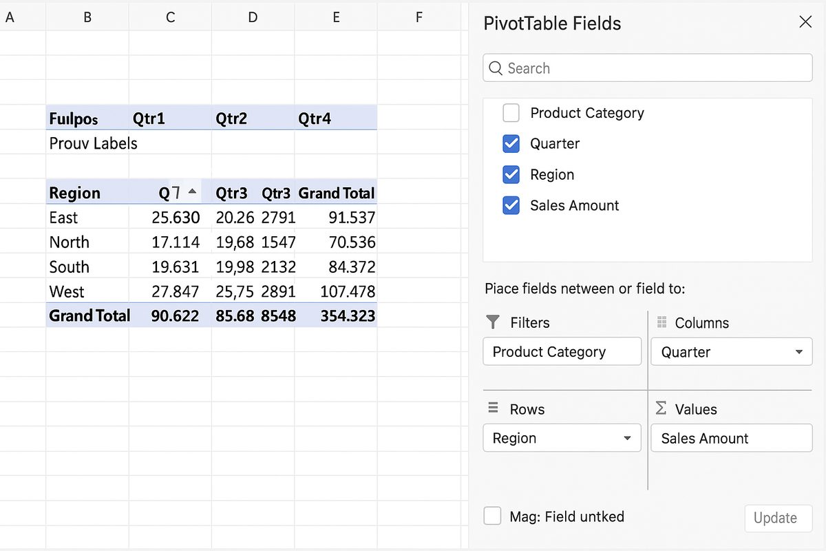
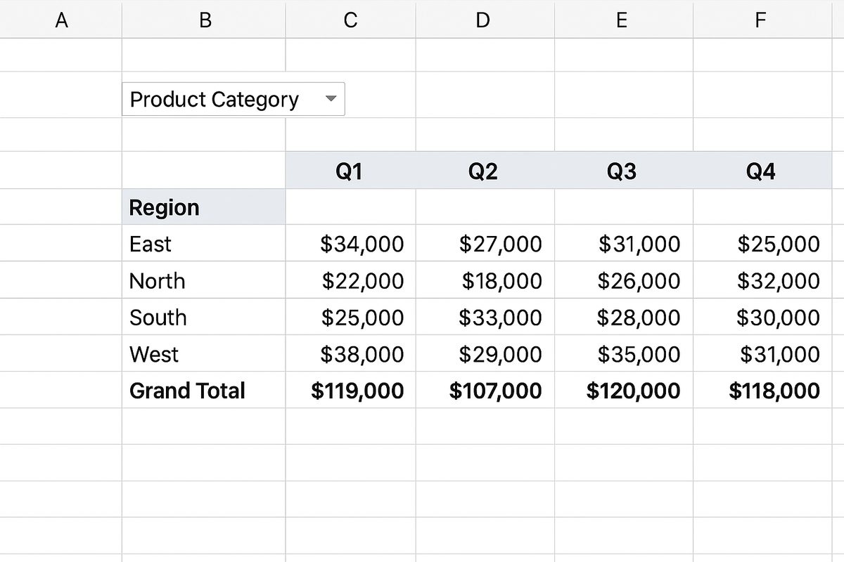
- Assign Fields: Drag Region to Rows, Quarter to Columns, Product Category to Filters, and Sales Amount to Values.
- Analyze: The pivot table now shows total sales by region (rows) across quarters (columns), with the ability to filter by product category.
- Drill Down: Add Salesperson below Region in Rows to see individual salesperson performance within each region.
Tips for Working with Pivot Table Fields
- Use meaningful field names: Clear field names help you understand the layout and make adjustments easier.
- Experiment with field placement: Moving fields between Rows and Columns can reveal different perspectives.
- Utilize filters wisely: Filters help keep your pivot tables clean and focused.
- Customize value calculations: Right-click any value cell to change the summary function (SUM, COUNT, MAX, etc.).
- Refresh data after updates: Always refresh your pivot table when the source data changes.
Common Mistakes to Avoid
- Placing text fields in Values area — this usually results in unexpected counts instead of sums.
- Ignoring filters which can limit the usefulness of pivot tables in dynamic reports.
- Overloading Rows or Columns with too many fields, making the pivot table cluttered and hard to read.
Frequently Asked Questions
Below are some common questions related to pivot table fields.